Guidelines and Brand Asset Library
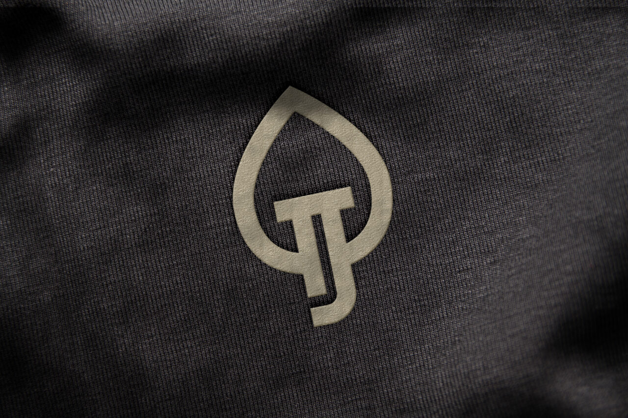
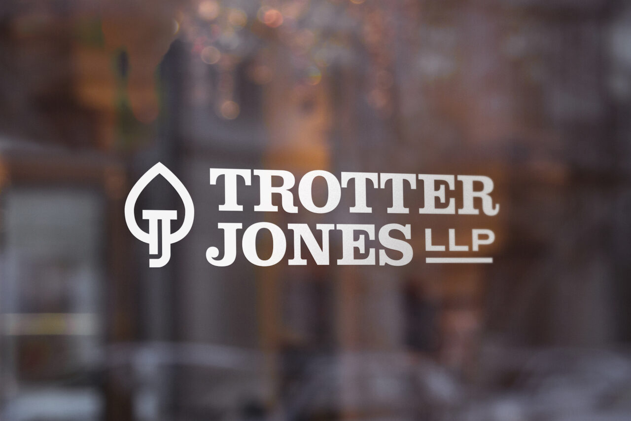
Turning over a new leaf.
Trotter Jones’ roots go deep. And like every firmly planted and well attended to business, it has grown. Just as the practice has evolved, breaking ground on a new, modern office, it’s time for the identity to do the same. We took the metaphor of the tree used throughout the website as inspiration from which we created an elegant, established icon. This unique monogram is complemented by an updated type treatment and color palette, lending a new level of sophistication to the brand.
Logos


Colors
We’ve matured the palette, departing slightly from the OG scheme and moving towards deeper, more earthy tones. The deep navy is complemented by a rich moss color – a departure from the brown of the past – to both differentiate the brand and play to its new incarnation.
Please refer to the following color builds for standards when creating assets for your brand. For print use CMYK and for digital and web applications use RGB or Hex. As a general rule one color or pattern won’t lead over another, but be aware of balance and context when choosing color for designs.
TJ Navy Blue
- HEX
- #173d4e
- CMYK
- 97% / 67% / 43% / 29%
- RGB
- 23% / 61% / 78%
- PMS
- 302 U / 7477 C
TJ Moss Green
- HEX
- #605f3b
- CMYK
- 55% / 45% / 84% / 27%
- RGB
- 96% / 95% / 59%
- PMS
- 5815 U / 455 C
TJ Gray
- HEX
- #828281
- CMYK
- 48% / 41% / 38% / 4%
- RGB
- 130% / 130% / 129%
- PMS
- 423 U / 428 C
A NOTE ON COLOR
While we always strive for color accuracy, there are many factors at play when viewing color on screen or on physical objects, like paper, signage and products. The “same” color will never look the same across different substrates—and even different monitors, screens and textures of paper reflect color slightly differently.
Therefore, please expect a certain amount of variation between print (chemicals on paper), web (light) and physical products (plastic/cloth/dyes, etc).
When color accuracy is paramount, we recommend printing using the Pantone Matching System (PMS). W/S will provide Pantone swatches upon request, which we recommend you approve before having anything printed.
We highly recommend you have your printer match colors to your satisfaction before moving forward on any print jobs.
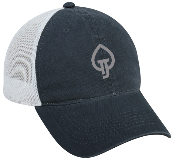
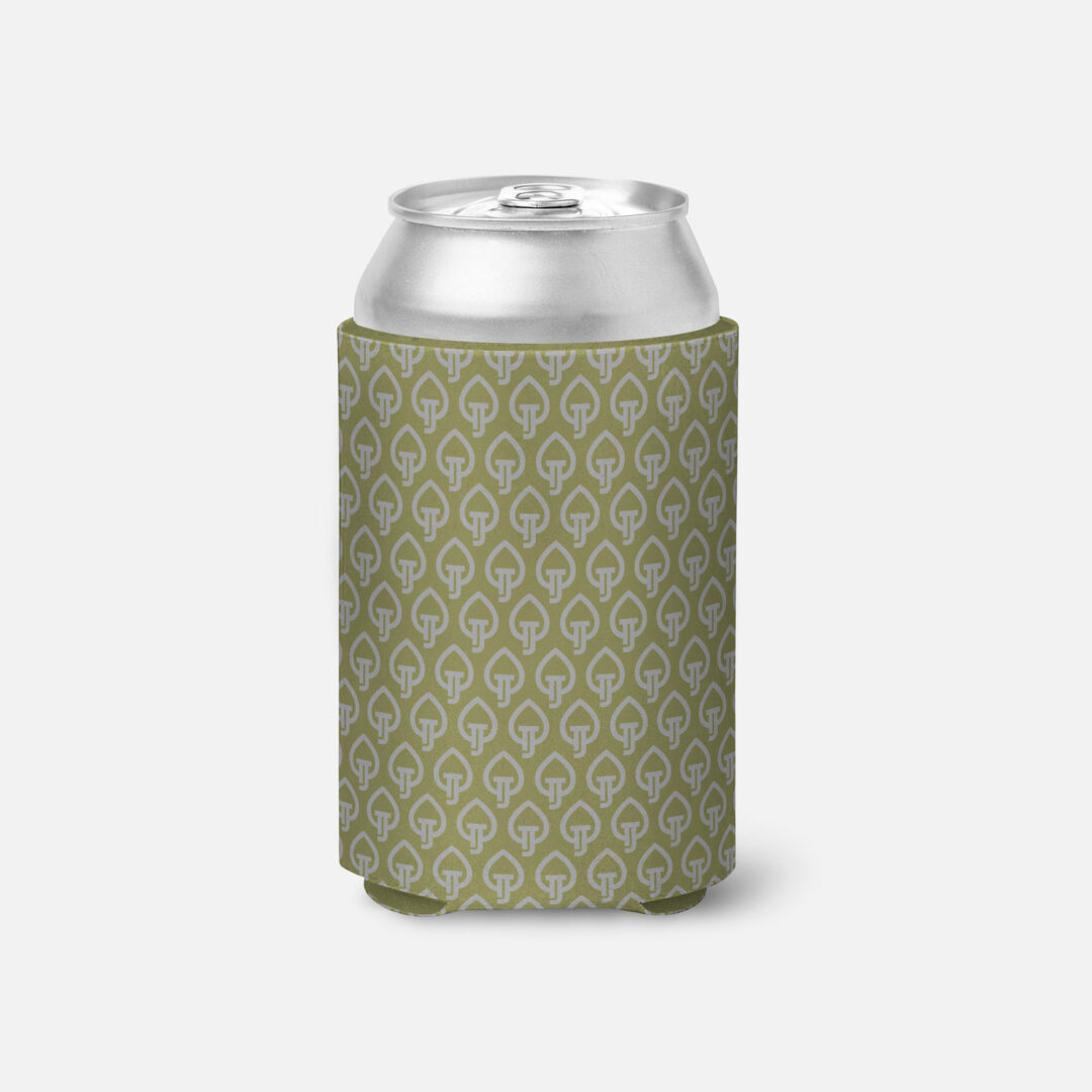
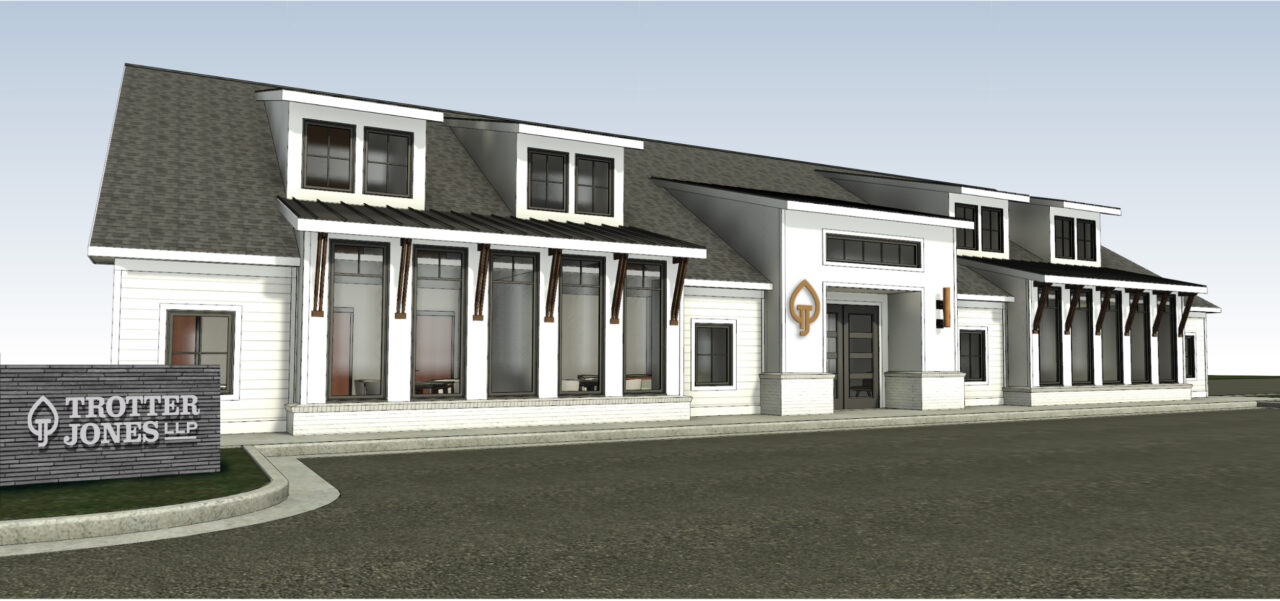
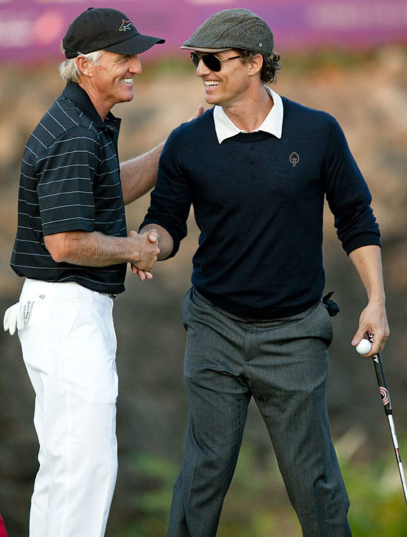
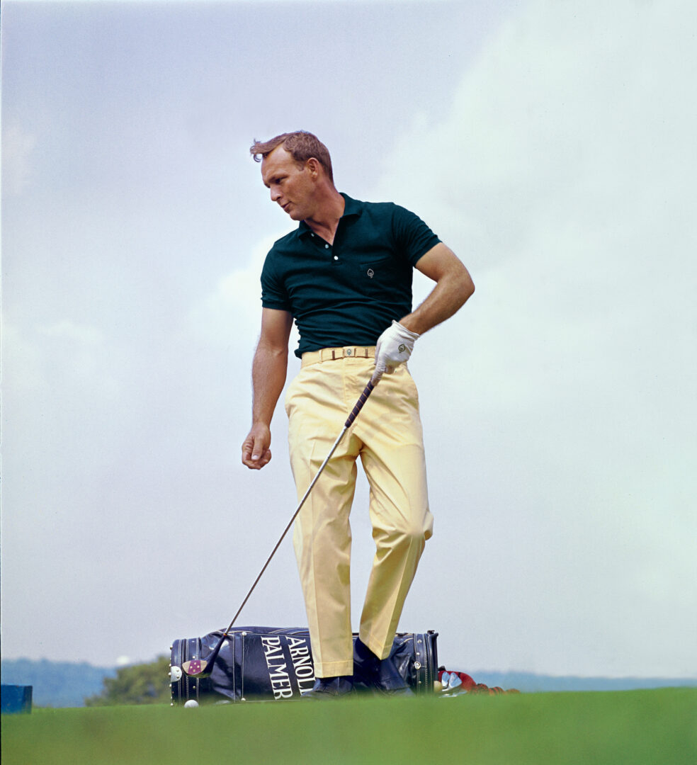
Brand In Use
Please refer to the following examples general guide for brand look and feel. Remember when designing Trotter Jones LLP assets to be mindful of legibility and balance. It’s important to establish an informational hierarchy to clearly communicate our messaging and tone.
Click on any of the images below to view a larger, uncropped version.
- Merchandise
- Environmental

Let's Make it Real. Showpony is our trusted partner in taking everything we make from digital to tangible. From print to products, they do it all (and they do it well). Anything you'd like to see your brand on something that we haven't shown you? The Ponies can make it happen.
Get Started →