
Guidelines and Brand Asset Library
Description

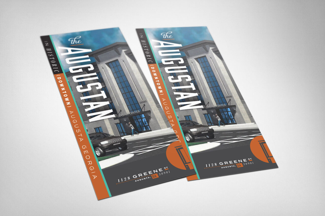
The Augustan is an impressive structure for downtown. Nestled right up to the sidewalk on Greene and comprising almost the entire block, it makes quite the impression as you come down Calhoun. And that's to say nothing of the interior which will no doubt set a new standard in amenities, finish and high-end apartment living in Augusta. The identity reflects the class and charm of this exciting project and is built with multiple elements to surprise and delight our audience.
Logo Guidelines
Logos for The Augustan are provided as-is, and should not be distorted, outlined, changed, or displayed in any way that diminishes the brand. If you have questions about usage, please contact Wier/Stewart at (706) 447-2630.
Clear Space
Ensure there is always enough clear space around the logo.

Changes
Do not distort, outline or change the logo from the primary colors in its palette.


Backgrounds
Do not use it over a background where it would be hard to read.


Vertical Logo


When placing the Vertical Logo CENTER VISUALLY, Use the cap height of the UGUSTAN to visually horizontally center the mark. If you use your program to horizontally center it, it will be off balance.
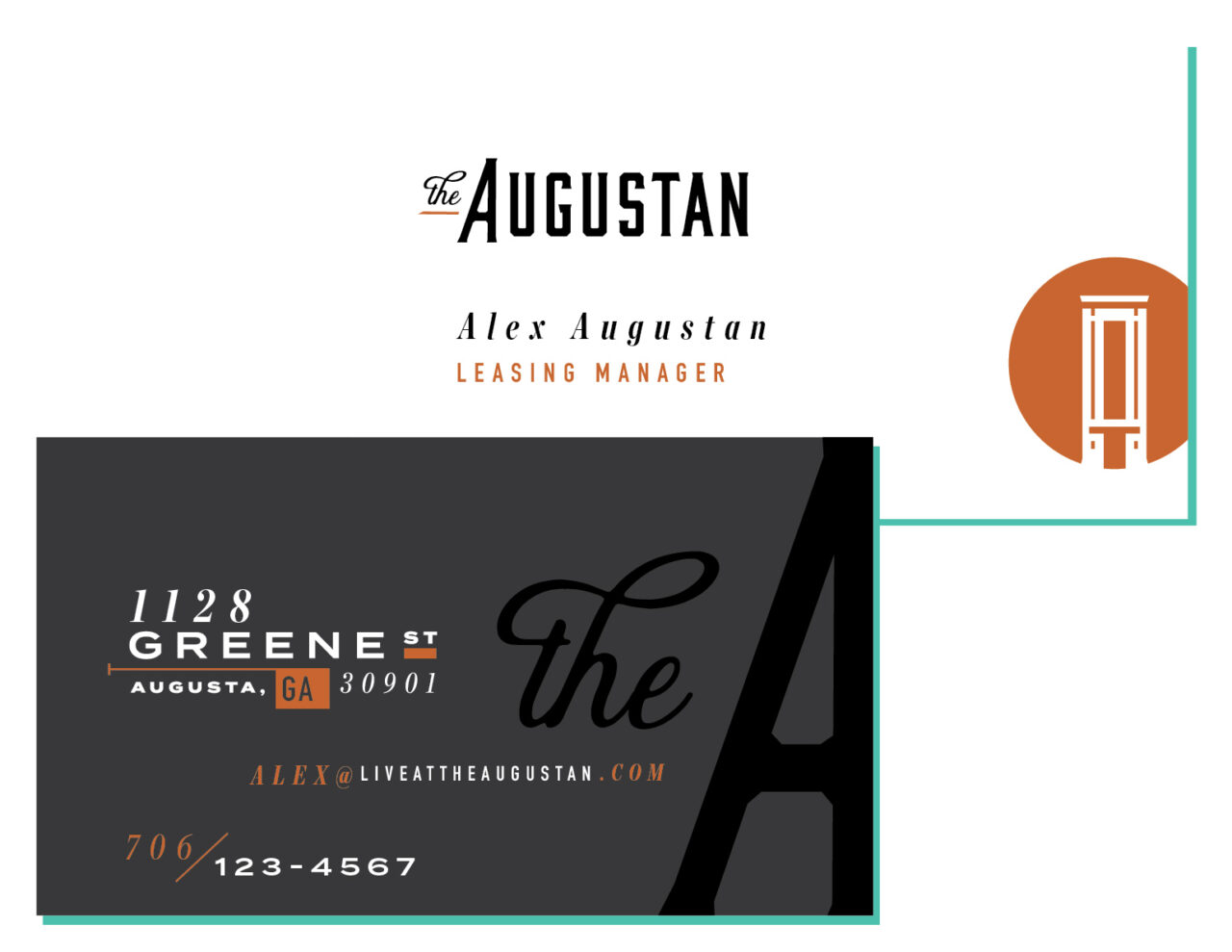
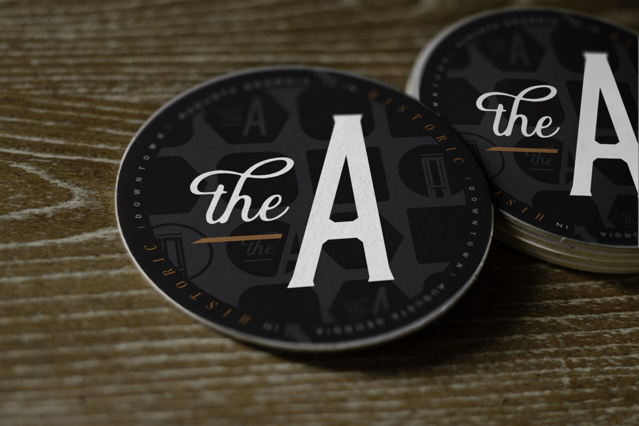
“The A”


“The A” (Circle)


“The A” (Square)


“The A” (Hexagon)


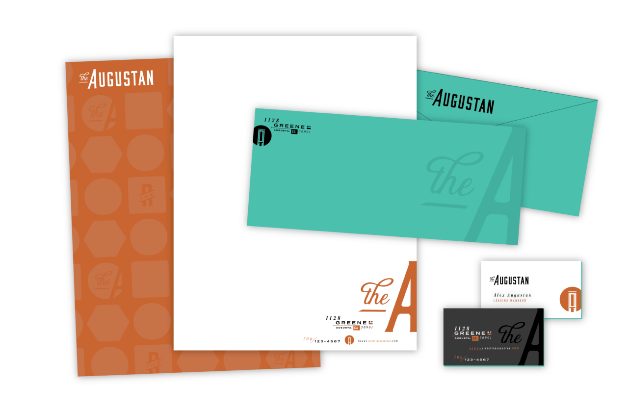
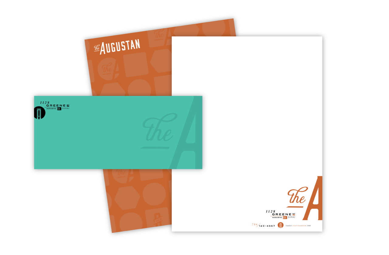
Color Palette
The formality and class of black anchors our palette, lending a high-end feel to the identity. This is complemented by a copper pulled from the entry way and a tertiary pop of turquoise.
Please refer to the following color builds for standards when creating assets for your brand. For print use CMYK and for digital and web applications use RGB or Hex. As a general rule one color or pattern won’t lead over another, but be aware of balance and context when choosing color for designs.
Black
- HEX
- #231f20
- CMYK
- 70% / 67% / 64% / 74%
- RGB
- 35% / 31% / 32%
- PMS
- --
Copper
- HEX
- #c4632e
- CMYK
- 18% / 71% / 96% / 5%
- RGB
- 196% / 99% / 46%
- PMS
- 8943 C
Patina
- HEX
- #50c0ad
- CMYK
- 64% / 0% / 40% / 0%
- RGB
- 80% / 192% / 173%
- PMS
- 3252 C
A NOTE ON COLOR
While we always strive for color accuracy, there are many factors at play when viewing color on screen or on physical objects, like paper, signage and products. The “same” color will never look the same across different substrates—and even different monitors, screens and textures of paper reflect color slightly differently.
Therefore, please expect a certain amount of variation between print (chemicals on paper), web (light) and physical products (plastic/cloth/dyes, etc).
When color accuracy is paramount, we recommend printing using the Pantone Matching System (PMS). W/S will provide Pantone swatches upon request, which we recommend you approve before having anything printed.
We highly recommend you have your printer match colors to your satisfaction before moving forward on any print jobs.
Typography
The typography is, in a word, eclectic. The combination of the two weights of Termina, DIN Condensed Bold and Chronicle Display Bold Italic (our sole sans serif) create a rich and fashionable tone reflective of the experience at The A.


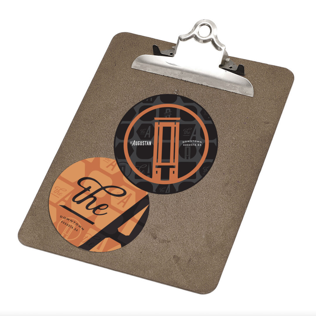
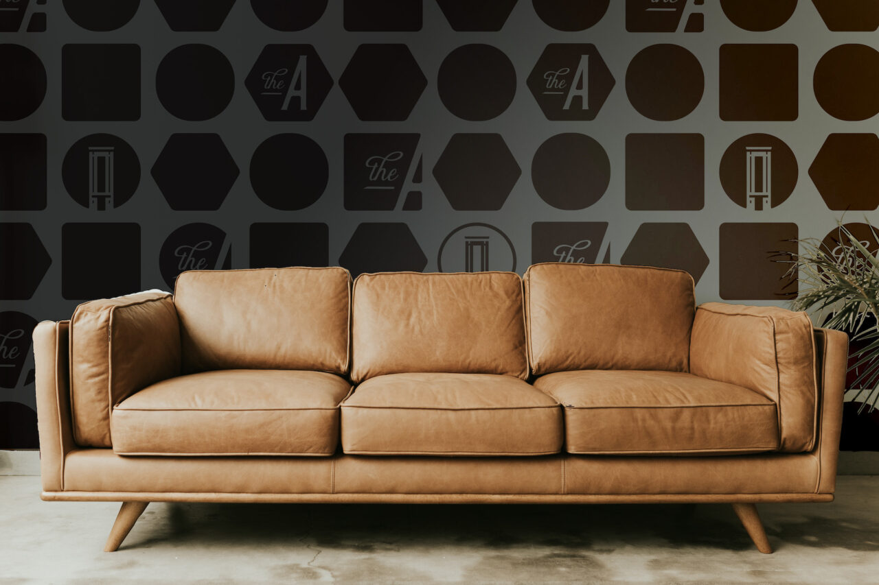
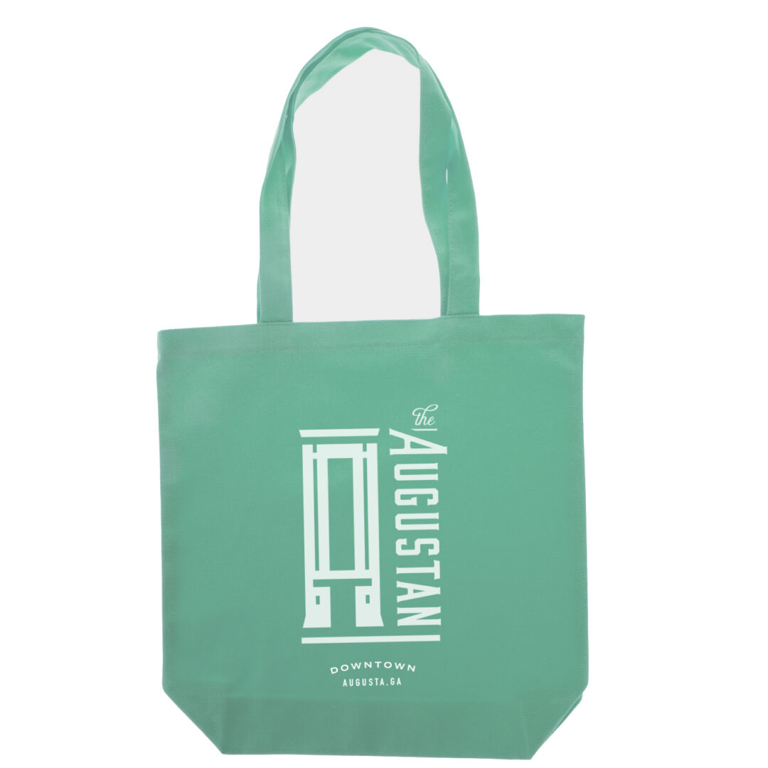
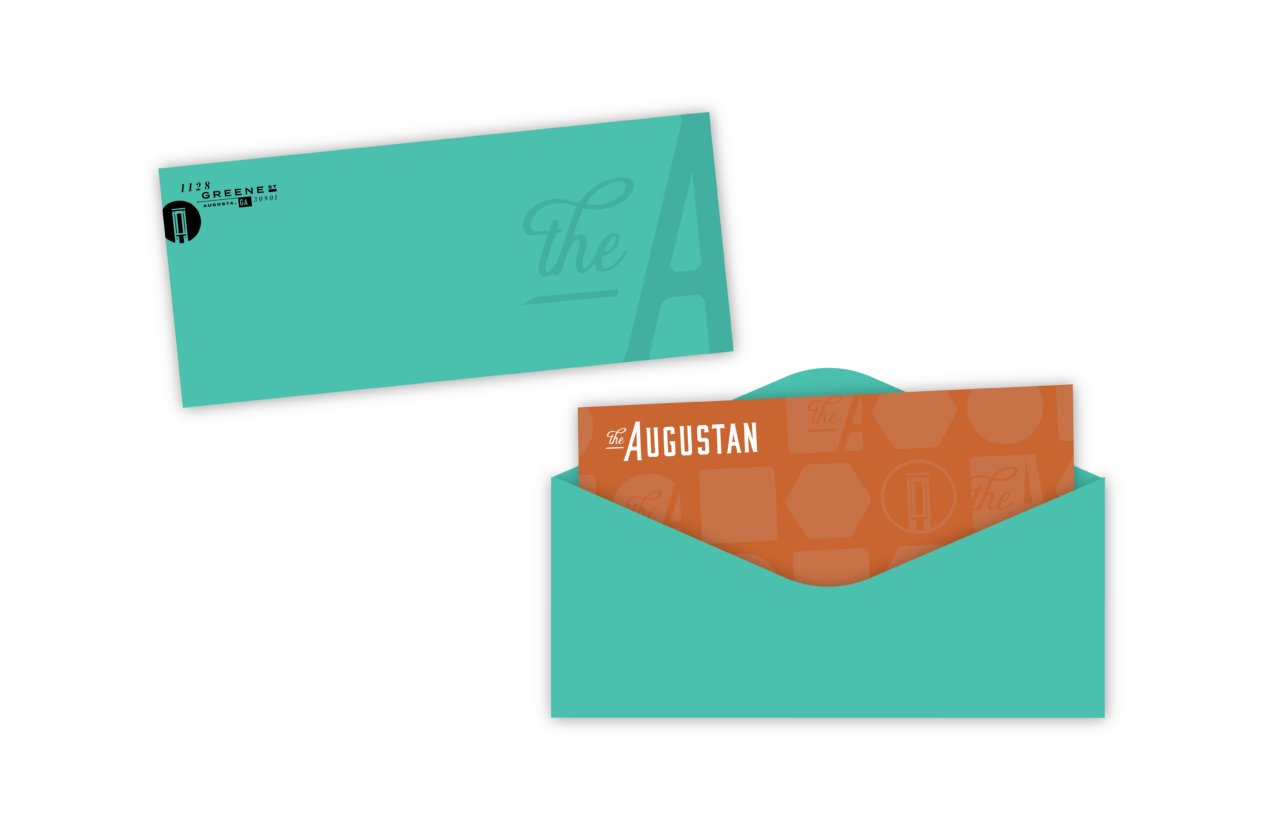
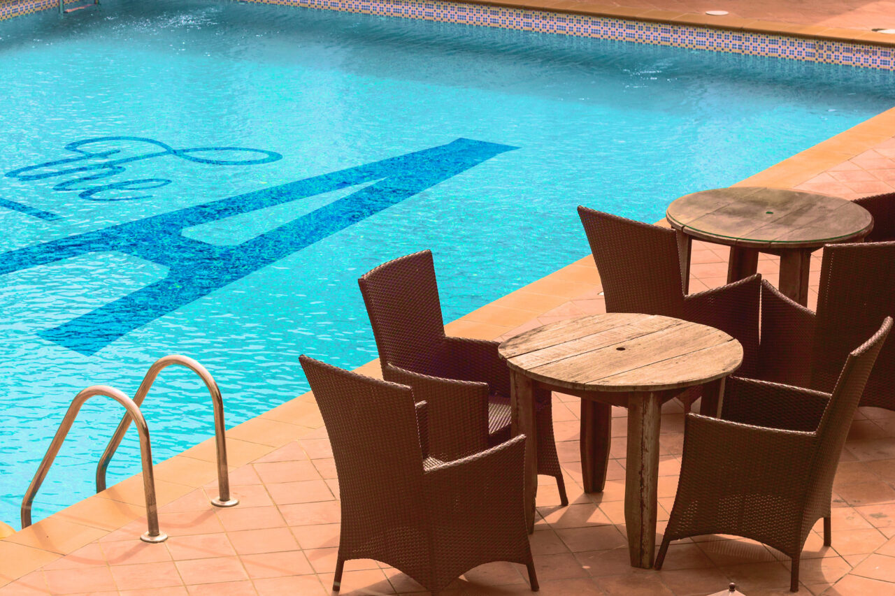
Brand In Use
Please refer to the following examples general guide for brand look and feel. Remember when designing The Augustan assets to be mindful of legibility and balance. It’s important to establish an informational hierarchy to clearly communicate our messaging and tone.
Click on any of the images below to view a larger, uncropped version.
- Environmental
- Merchandise


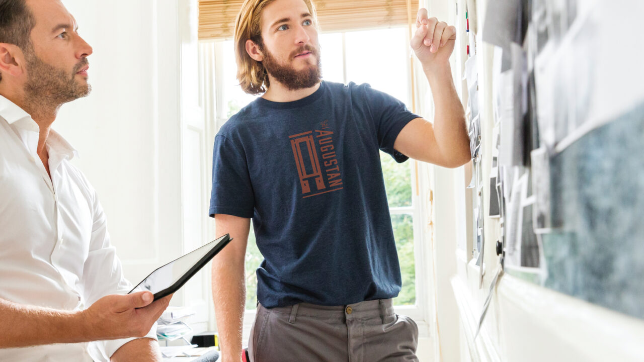

Let's Make it Real. Showpony is our trusted partner in taking everything we make from digital to tangible. From print to products, they do it all (and they do it well). Anything you'd like to see your brand on something that we haven't shown you? The Ponies can make it happen.
Get Started →