
Guidelines and Brand Asset Library
BRAND BASICS
In order to maintain our mission of a superior medical experience please use the following standards across all platforms and materials. This will ensure consistency and quality throughout the brand.
Burke Health: a unique name for a unique medical center.
01 Logos
Burke Health logos and icons for digital (RGB) and print (CMYK) purposes can be found here. Please remember it’s ideal to lead with full color logos, but in instances where contrast is limited designs should use a reversed or one color option.
Burke Health
Primary + Reversed

Stacked + Reversed


Horizontal + Reversed


Stacked Alt + Reversed


Icons
01a Specialty Logos
Cardiology
Horizontal + Reversed


Stacked + Reversed


Imaging
Horizontal + Reversed


Stacked + Reversed


Orthopedics
Horizontal + Reversed


Stacked + Reversed


Rehabilitation
Horizontal + Reversed


Stacked + Reversed


Sports Medicine
Horizontal + Reversed


Stacked + Reversed


Therapy
Horizontal + Reversed


Stacked + Reversed


02 COLORS
Please refer to the following color builds for standards when creating assets for your brand. For print use CMYK and for digital and web applications use RGB or Hex. As a general rule one color or pattern won’t lead over another, but be aware of balance and context when choosing color for designs.
Color 1
CMYK: 87,93,39,39
RGB: 50, 34, 76
HEX: #32224c
PMS: 3524 C
Color 2
CMYK: 55,0,23,0
RGB: 106, 201, 203
HEX: #6ac9cb
PMS: 2226 C
Color 3
CMYK: 29,4,100,0
RGB: 193, 207, 48
HEX: #c1cf30
PMS: 2297 C
Color 4
CMYK: 83,44,11,0
RGB: 31, 125, 178
HEX: #1F7DB2
PMS: 2172 C
A NOTE ON COLOR
While we always strive for color accuracy, there are many factors at play when viewing color on screen or on physical objects, like paper, signage and products. The “same” color will never look the same across different substrates—and even different monitors, screens and textures of paper reflect color slightly differently.
Therefore, please expect a certain amount of variation between print (chemicals on paper), web (light) and physical products (plastic/cloth/dyes, etc).
When color accuracy is paramount, we recommend printing using the Pantone Matching System (PMS). W/S will provide Pantone swatches upon request, which we recommend you approve before having anything printed.
We highly recommend you have your printer match colors to your satisfaction before moving forward on any print jobs.
AUX CROSS PATTERN
Providing subtle sophistication and reinforcing the fact that we are a medical center, the cross pattern is deployed across communications to help further brand them as Burke Health.
Option 1:
Option 2:
03 FONTS
Header Copy

Body Copy

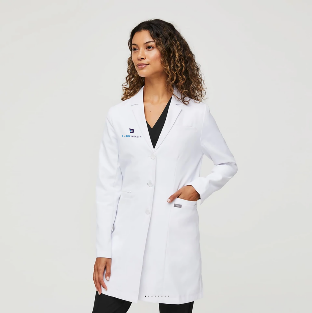
04 PHOTOGRAPHY
When choosing photography for branded materials please consider tone and composition first and foremost. Tone should reflect our connection to the community and convey our commitment to the customer experience.
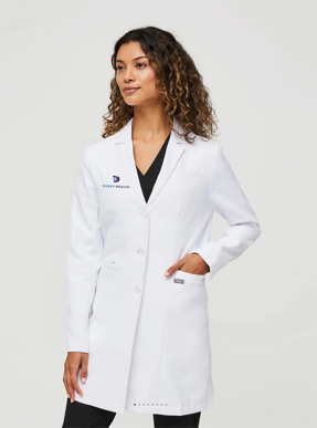

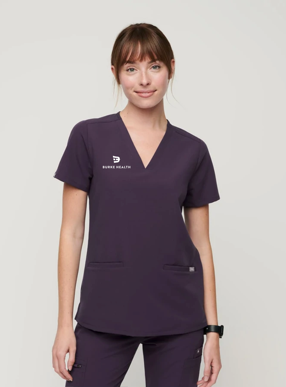
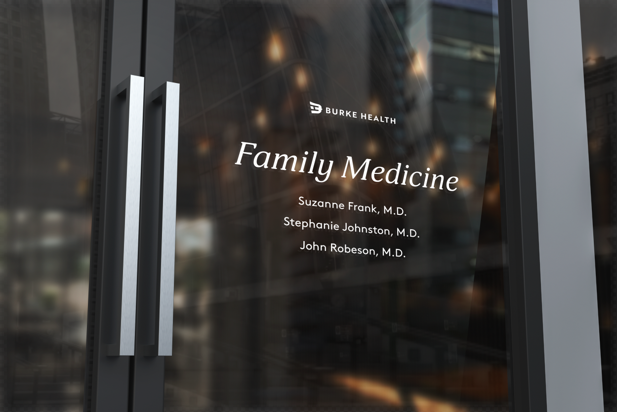
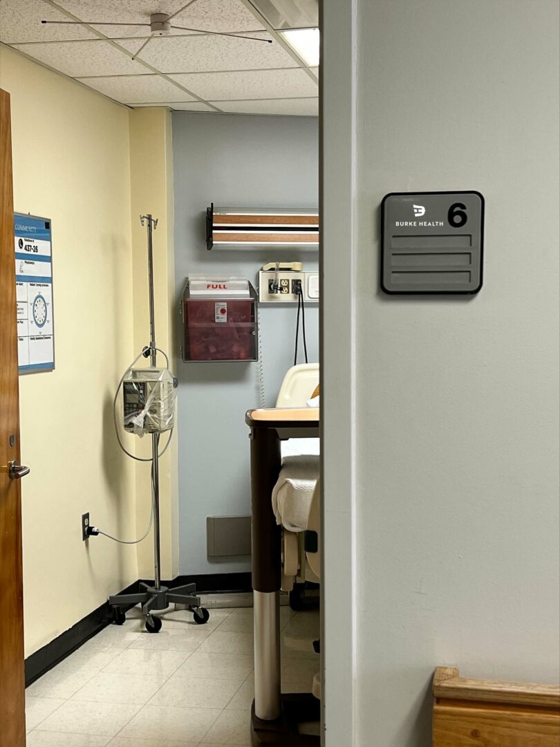
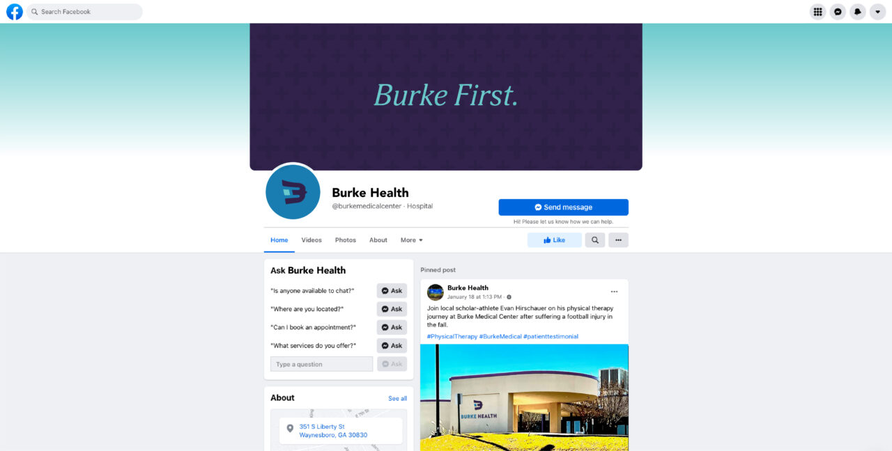
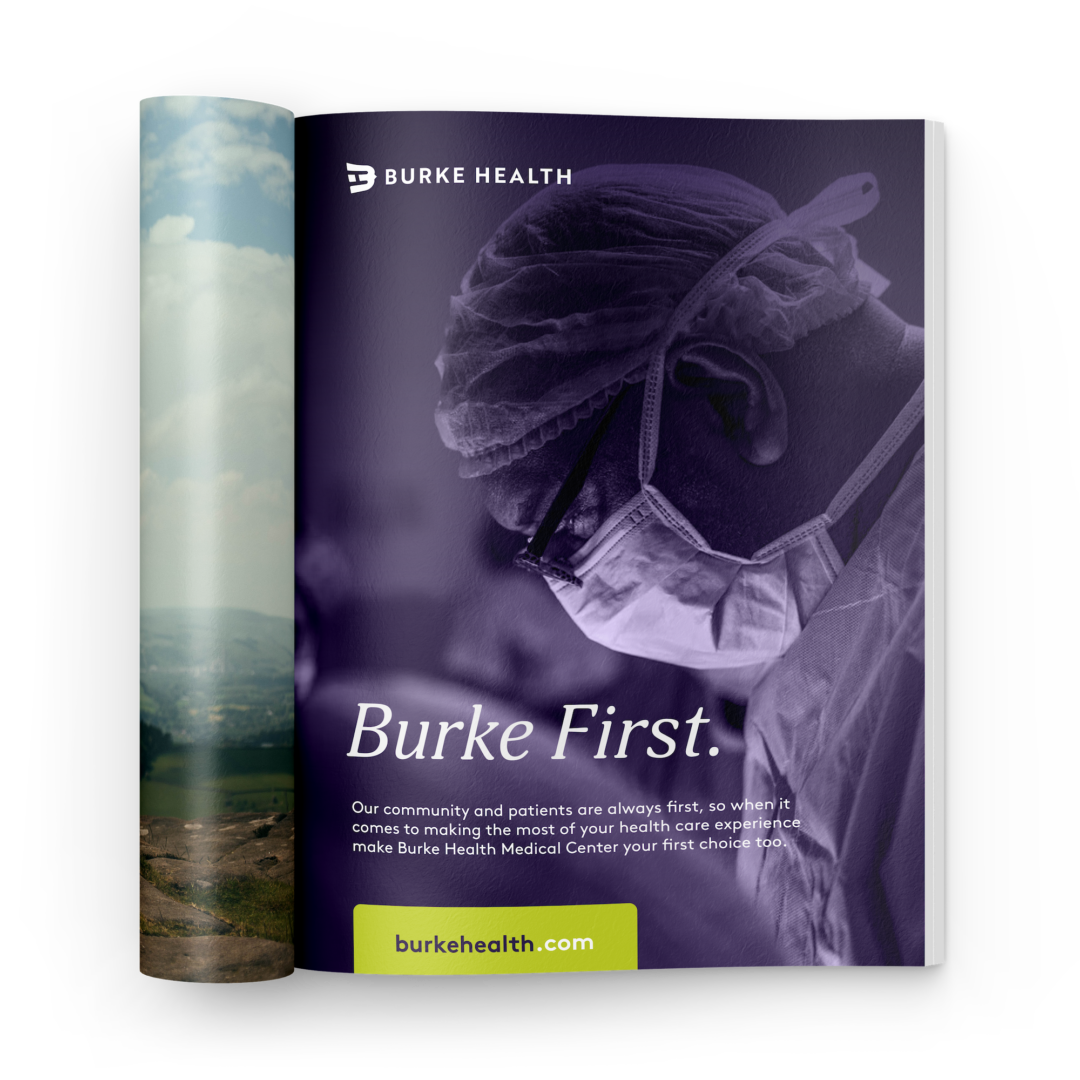
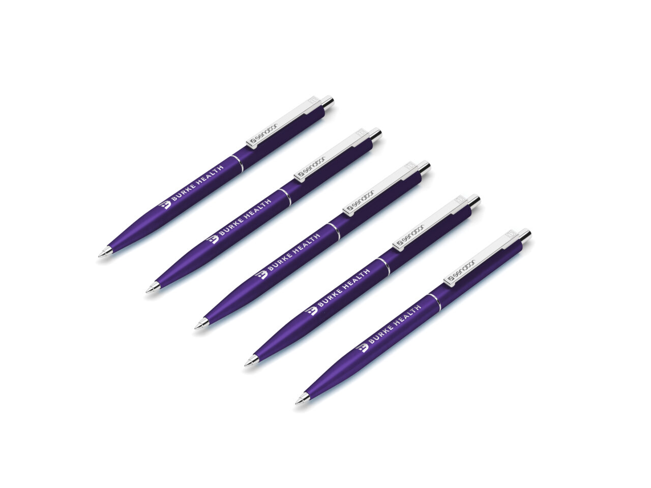
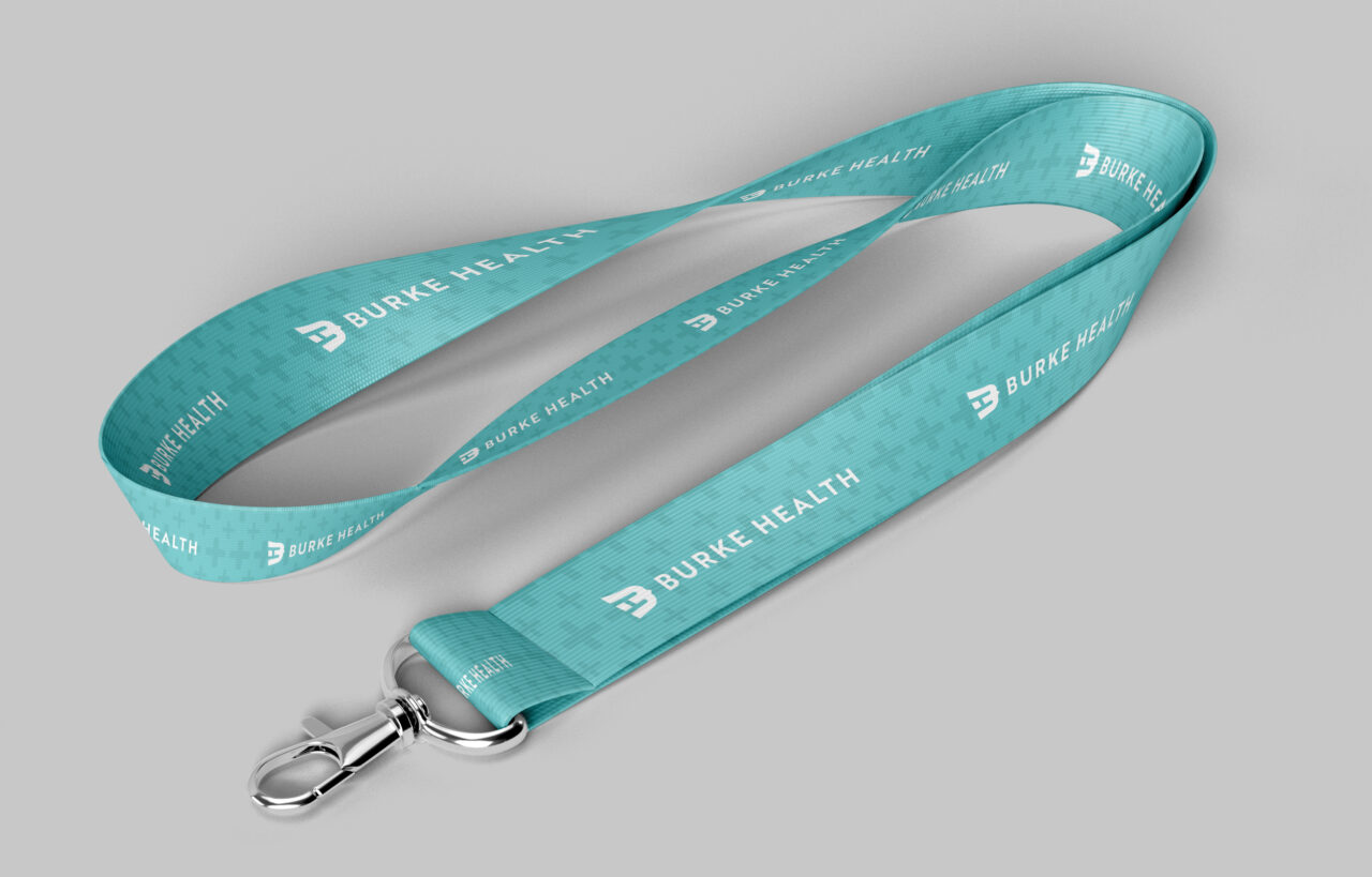
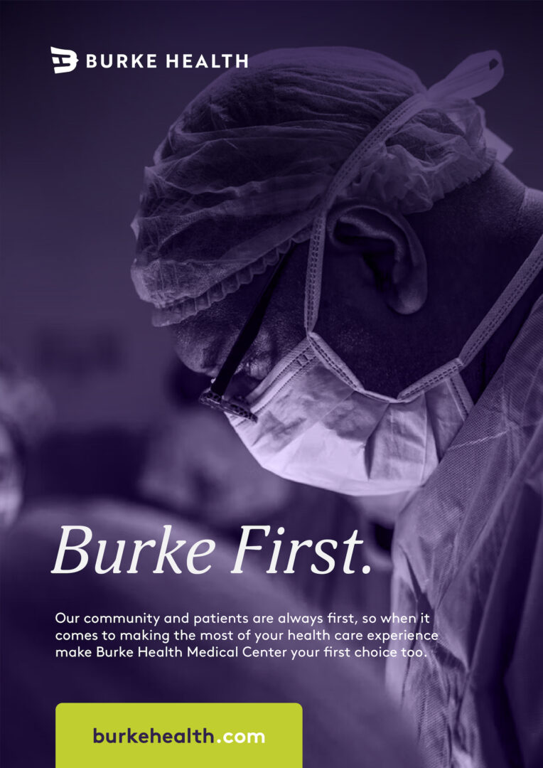
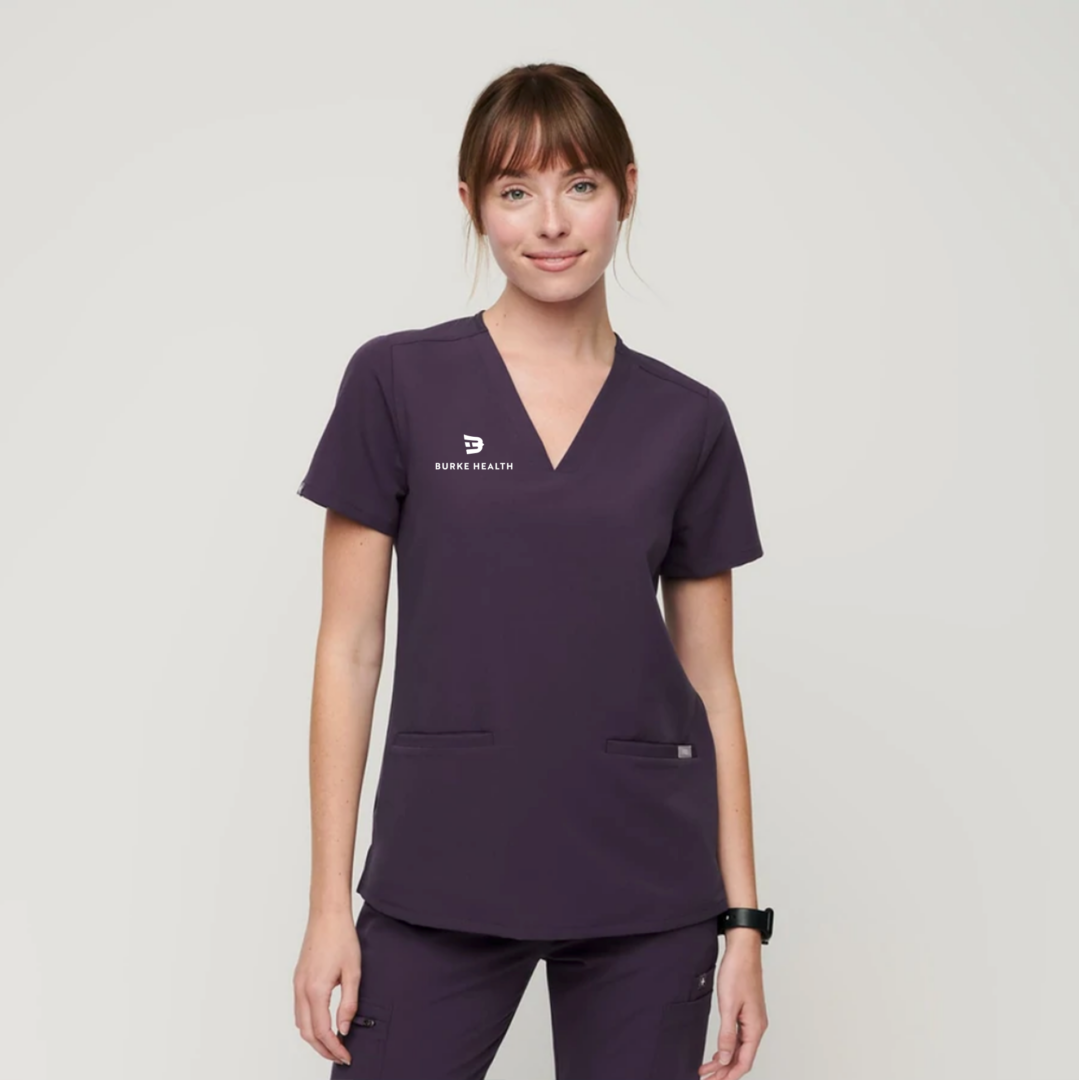
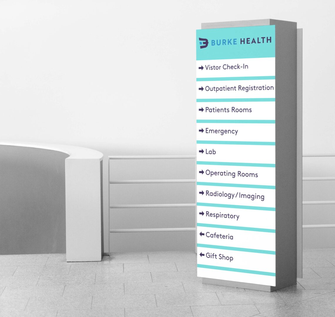
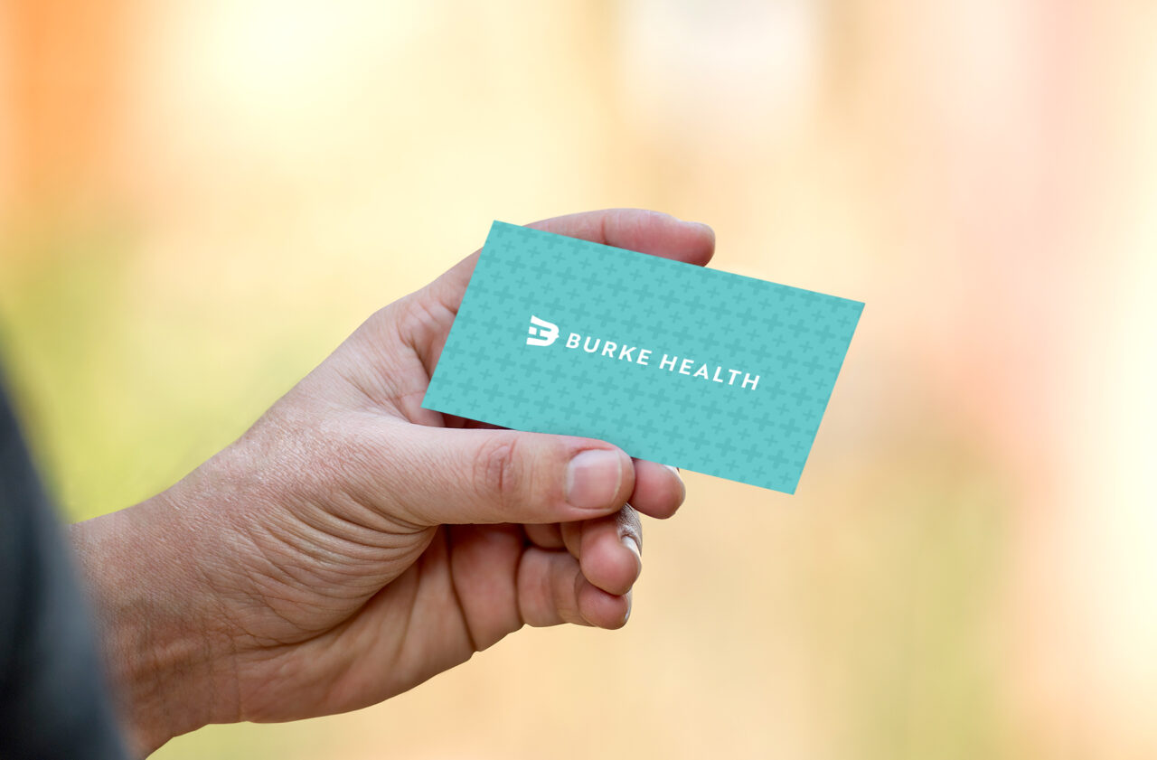
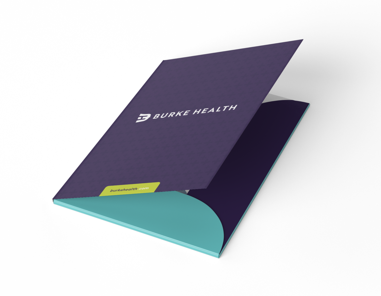
05 BRAND IN USE
Please refer to the following examples general guide for brand look and feel. Remember when designing Burke Health assets to be mindful of legibility and balance. It’s important to establish an informational hierarchy to clearly communicate our messaging and tone.
- Digital
- Environmental
- Merchandise


Let's Make it Real. Showpony is our trusted partner in taking everything we make from digital to tangible. From print to products, they do it all (and they do it well). Anything you'd like to see your brand on something that we haven't shown you? The Ponies can make it happen.
Get Started →