
Guidelines and Brand Asset Library
Café Dulce is poised for big success with the delicious franchise duo of Land of a Thousand Hills independent coffee and Whit’s Frozen Custard. An interesting juxtaposition of menu options, the name already reflects this duality, and we’ve designed the identity to reflect that.
Café Dulce's logo and brand assets are the launchpad for telling our story. Consistency in execution is critical to reinforcing our identity, and for maintaining visual quality. These guidelines will help to properly implement our brand across all platforms and materials, and communicate effectively with our audience.
01 Logos
Café Dulce logos and icons for digital (RGB) and print (CMYK) purposes can be found here. Please remember it’s ideal to lead with full color logos, but in instances where contrast is limited designs should use a reversed or one color option.
Badge Logo
Horizontal Logo


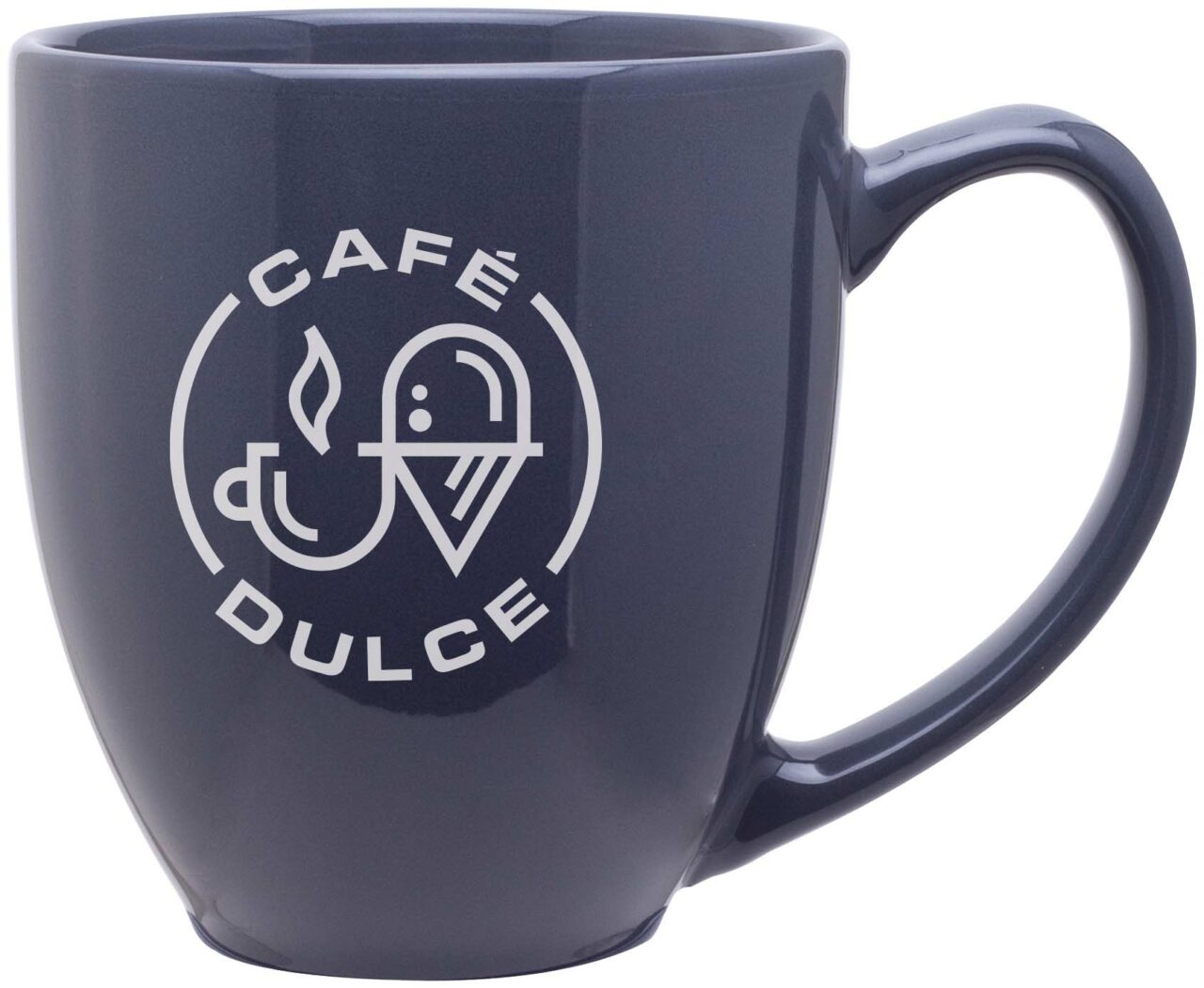
Stacked Logo


Patterns
Each ZIP file includes AI (Adobe Illustrator) files with all of the patterns included (and their associated swatches/patterns) and an ASE (Adobe Swatch Exchange) file.
02 COLORS
Inspired by modern and minimalist coffee-haus interiors, the palette leans masculine-industrial, with a surprise pops of pink. Espresso and latte represent the barista side of the business, and sparingly-used pale pink brings in color that represents the Dulce, sweet side, of the menu.
Please refer to the following color builds for standards when creating assets for your brand. For print use CMYK and for digital and web applications use RGB or Hex. As a general rule one color or pattern won’t lead over another, but be aware of balance and context when choosing color for designs.
Cafe Dulce Custard Pink
CMYK: 0 / 11 / 3/ 0
RGB: 255 / 219 / 215
HEX: #ffdbd7
PMS: 705 C
Cafe Dulce Espresso Brown
CMYK: 28 / 48 / 71 / 73
RGB: 75 / 51 / 0
HEX: #493201
PMS: 2322 C
Cafe Dulce Latte
CMYK: 20% tint of Espresso CMYK
RGB: 219 / 214 / 204
HEX: #dbd6cc
PMS: 2322 C @ 20%
A NOTE ON COLOR
While we always strive for color accuracy, there are many factors at play when viewing color on screen or on physical objects, like paper, signage and products. The “same” color will never look the same across different substrates—and even different monitors, screens and textures of paper reflect color slightly differently.
Therefore, please expect a certain amount of variation between print (chemicals on paper), web (light) and physical products (plastic/cloth/dyes, etc).
When color accuracy is paramount, we recommend printing using the Pantone Matching System (PMS). W/S will provide Pantone swatches upon request, which we recommend you approve before having anything printed.
We highly recommend you have your printer match colors to your satisfaction before moving forward on any print jobs.
03 FONTS
Our brand fonts are Sweet Square Pro, Alkaline, and ITC Blair. Inspired by the chrome lettering on European espresso machines, and vintage soda shop ephemera, these three type families bring just the right amount of understated cool and handcraftedness to the streamlined vibe of Café Dulce.
Alkaline and ITC should be used sparingly, only as headlines. Never set long swaths of copy in these fonts. Sweet Square should be used for longer swaths of body copy.


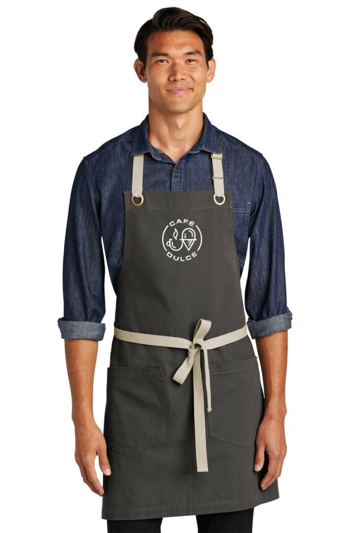
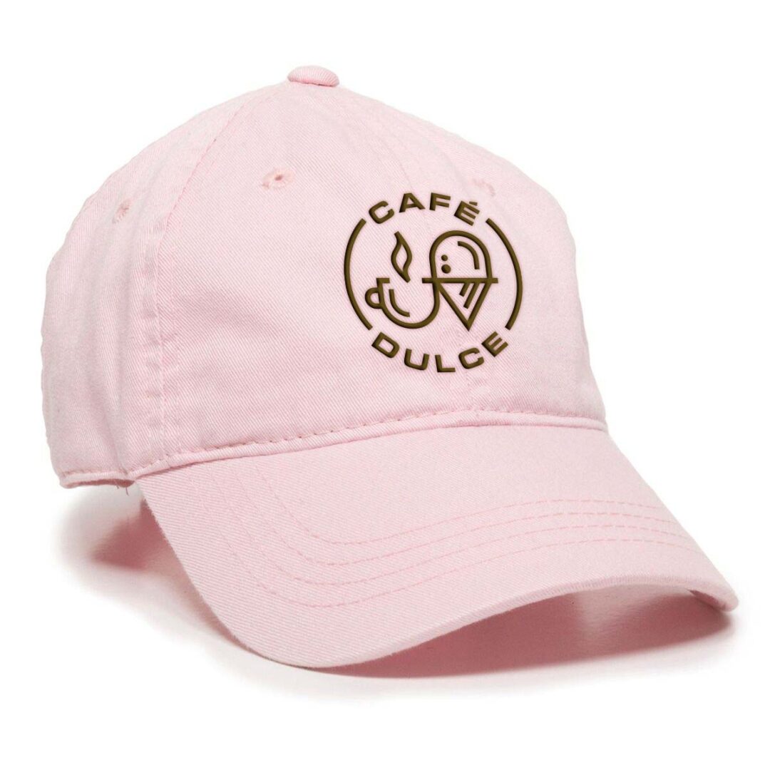
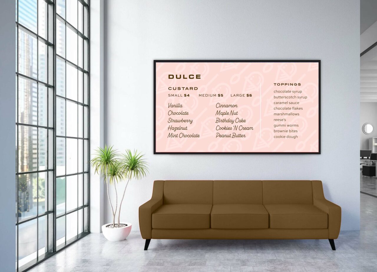
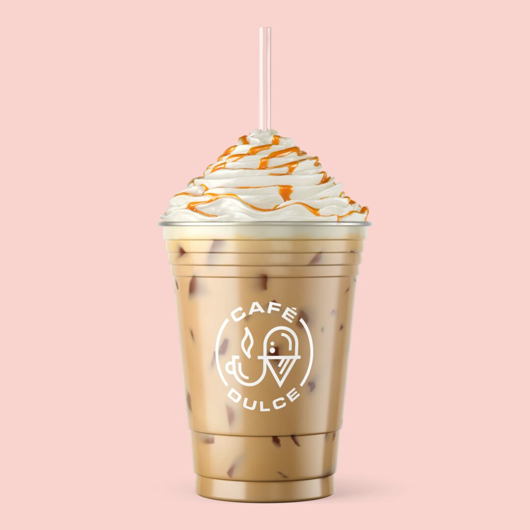
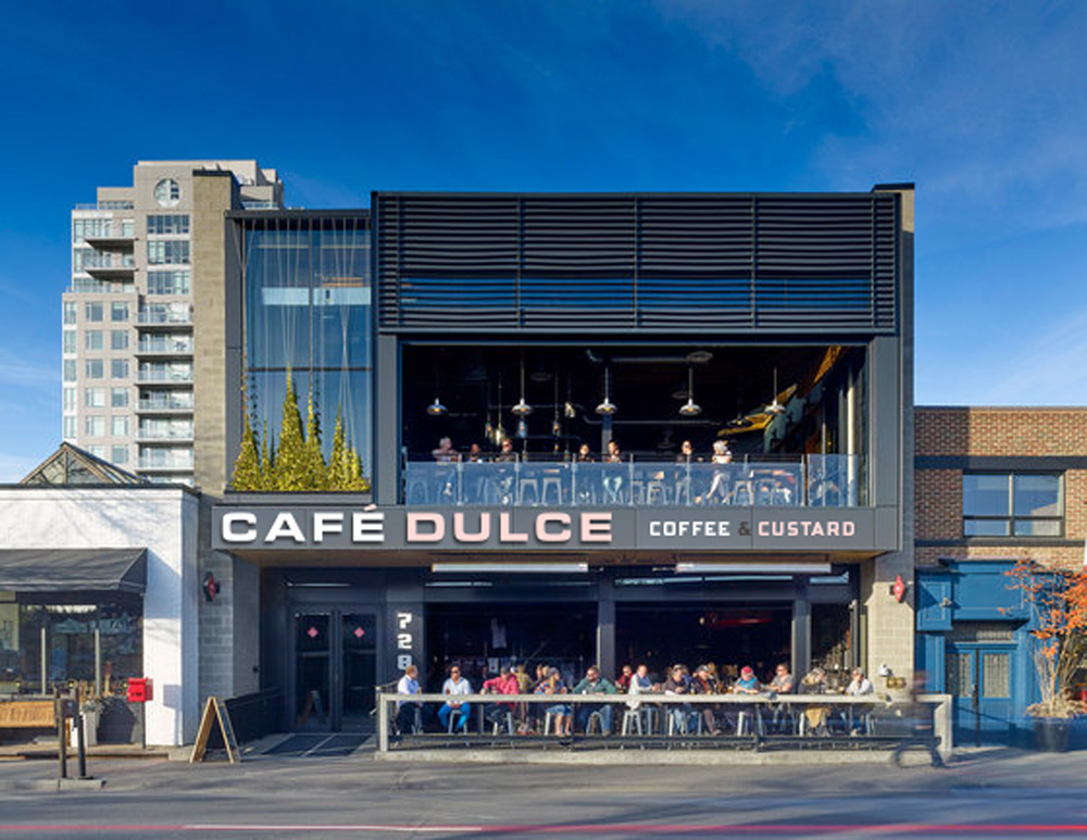
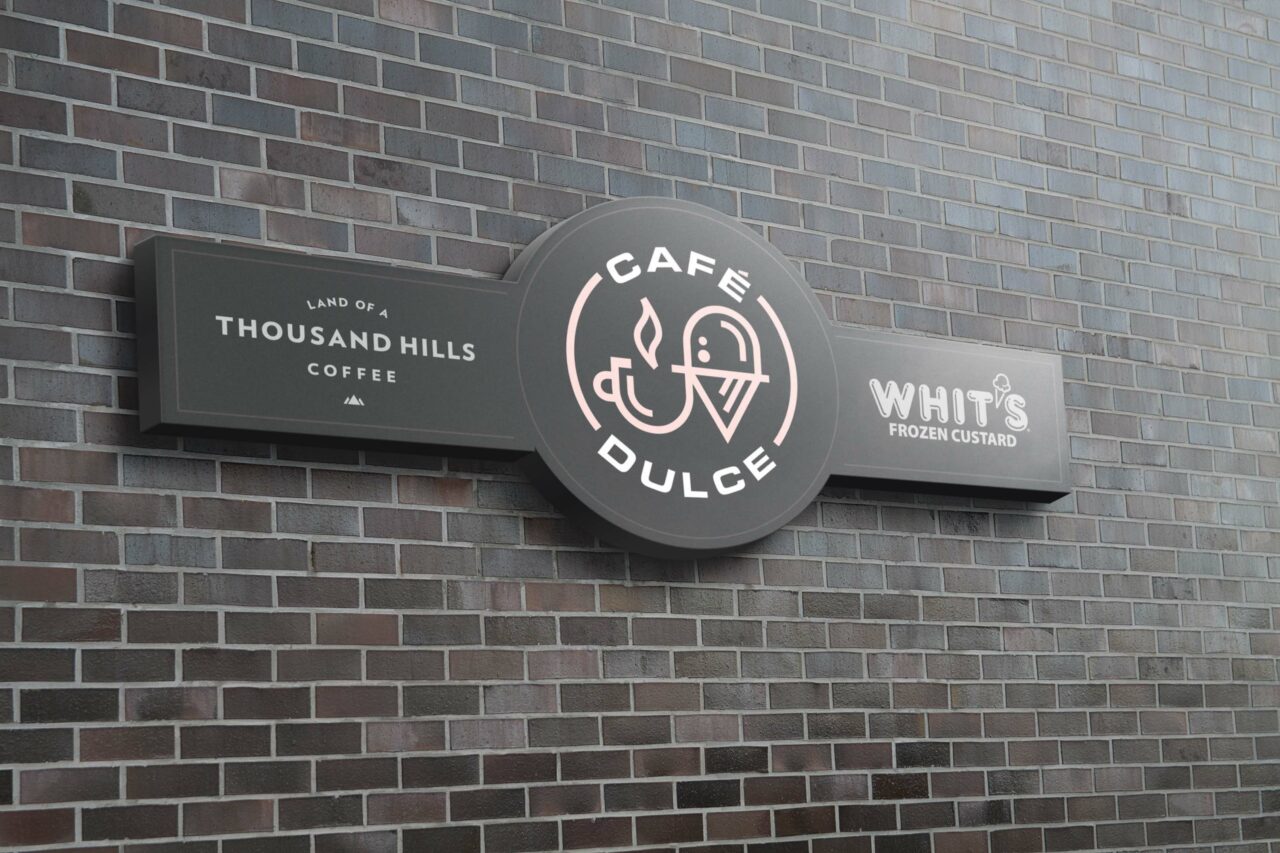
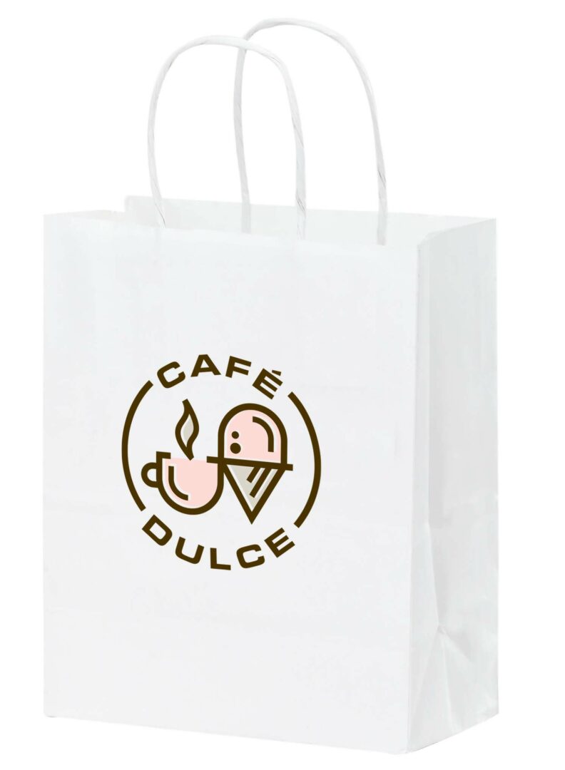
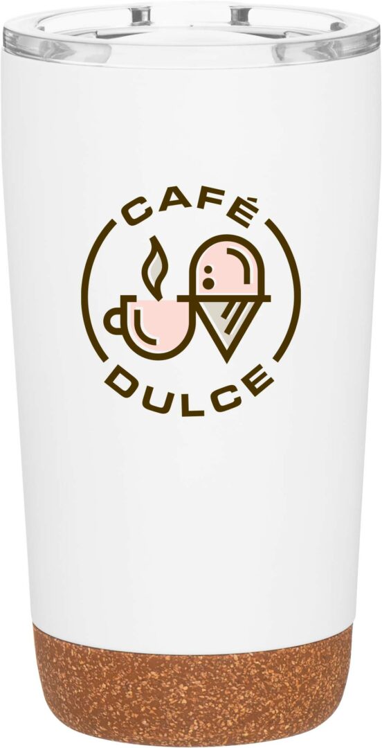
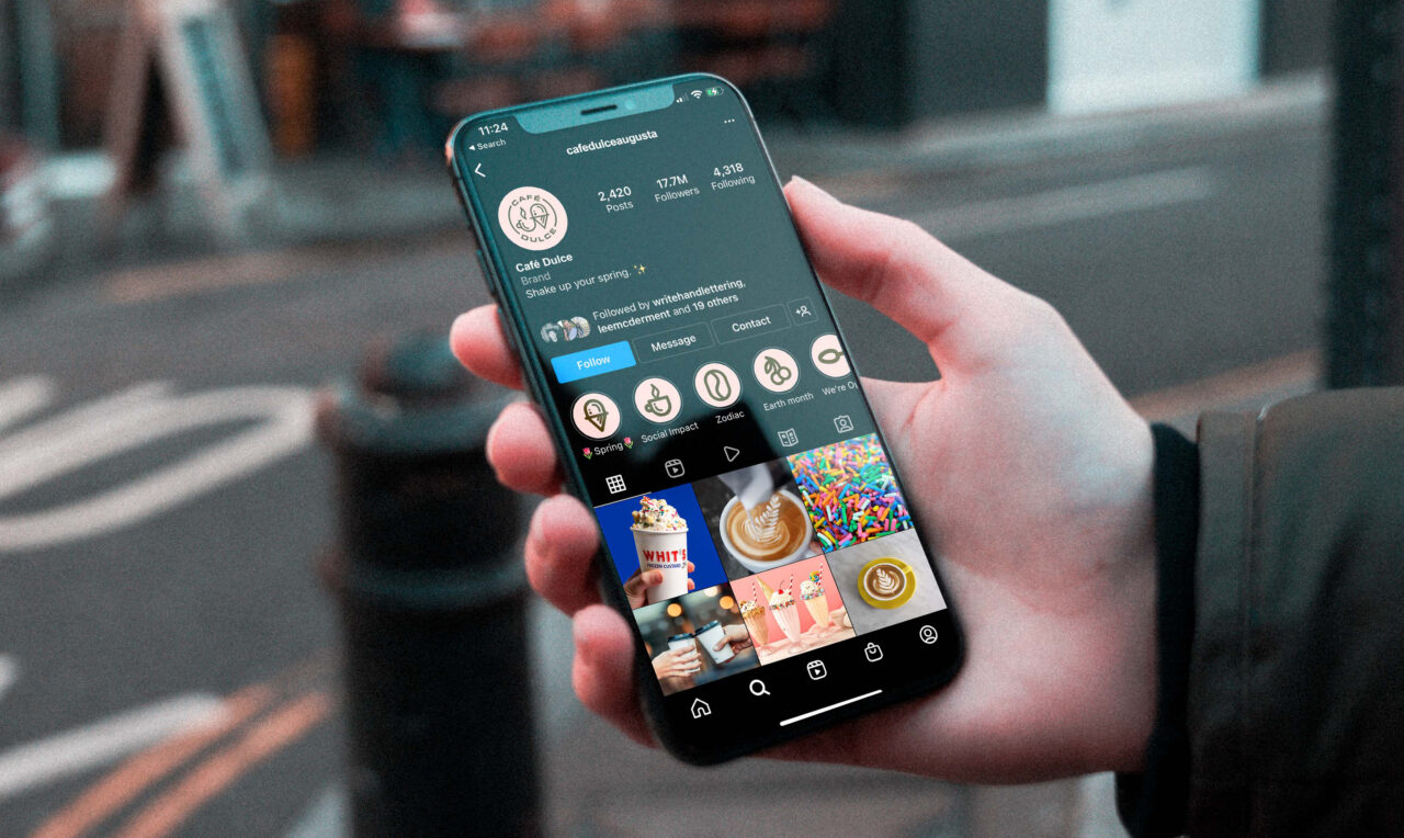
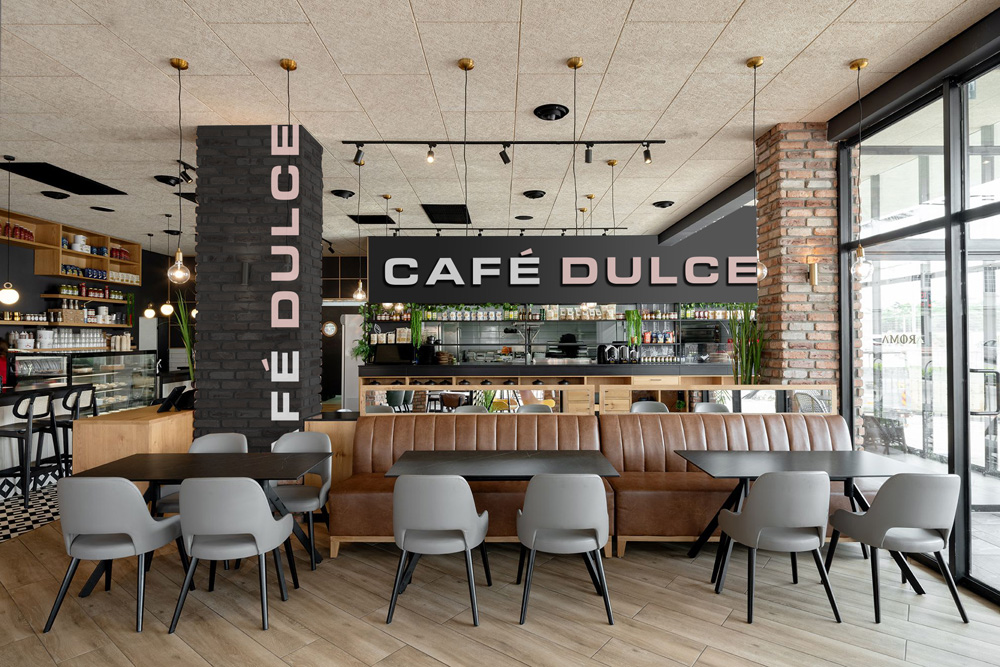
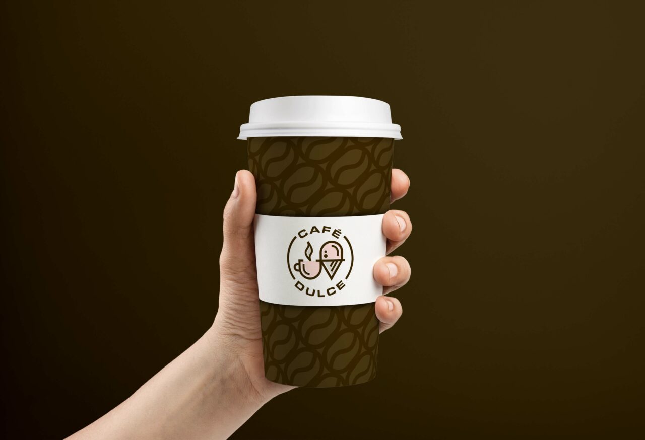
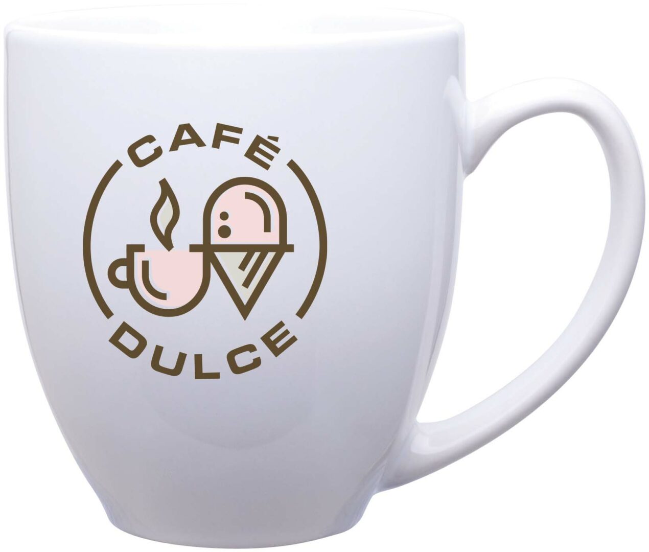
04 BRAND IN USE
Please refer to the following examples general guide for brand look and feel. Remember when designing Café Dulce assets to be mindful of legibility and balance. It’s important to establish an informational hierarchy to clearly communicate our messaging and tone.
Click on any of the images below to view a larger, uncropped version.
- Digital
- Merchandise
- Environmental


Let's Make it Real. Showpony is our trusted partner in taking everything we make from digital to tangible. From print to products, they do it all (and they do it well). Anything you'd like to see your brand on something that we haven't shown you? The Ponies can make it happen.
Get Started →