Guidelines and Brand Asset Library
When you’re building a brand aimed at unlocking the potential of professional and high achieving people, you need to look like you’ve already done the same for yourself. Establishing a tone of trustworthiness with a dash of personality helps gain traction among target audiences without really ever having to say a word. In a sea of basic sameness, Career Potential has to have a brand that stands out, first to get seen at all and, secondly, to give you those crucial few seconds of consideration from your targets where you can deliver your message.
Assets
PowerPoint Extras
Each ZIP file includes PNG and PDF files with design elements that can be used within PowerPoint presentations.
Backgrounds & Textures
Texture-only (2560×1700px)
Download AssetTransparent Texture (Black)
Download AssetTransparent Texture (Blue)
Download AssetTransparent Texture (Burnt Yellow)
Download AssetTransparent Texture (Purple)
Download AssetTransparent Texture (White)
Download AssetColors
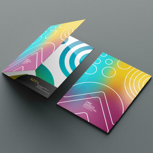
Our palette, built to differentiate you among your competition, includes a solid anchoring tone and a custom pattern mixing your range of color. It’s a metaphor for your breadth in the space and a bright, poppy breath of fresh air.
Please refer to the following color builds for standards when creating assets for your brand. For print use CMYK and for digital and web applications use RGB or Hex. As a general rule one color or pattern won’t lead over another, but be aware of balance and context when choosing color for designs.
Professional Charcoal
- HEX
- #585c5a
- CMYK
- 4% / 0% / 2% / 64%
- RGB
- 88% / 92% / 90%
- PMS
- --
Growth Gold
- HEX
- #ffd182
- CMYK
- 0% / 18% / 49% / 0%
- RGB
- 255% / 209% / 130%
- PMS
- --
Teaching Turquoise
- HEX
- #a4d4d4
- CMYK
- 23% / 0% / 0% / 17%
- RGB
- 164% / 212% / 212%
- PMS
- --
Personality Plum
- HEX
- #8c6484
- CMYK
- 0% / 29% / 6% / 45%
- RGB
- 140% / 100% / 132%
- PMS
- --
A NOTE ON COLOR
While we always strive for color accuracy, there are many factors at play when viewing color on screen or on physical objects, like paper, signage and products. The “same” color will never look the same across different substrates—and even different monitors, screens and textures of paper reflect color slightly differently.
Therefore, please expect a certain amount of variation between print (chemicals on paper), web (light) and physical products (plastic/cloth/dyes, etc).
When color accuracy is paramount, we recommend printing using the Pantone Matching System (PMS). W/S will provide Pantone swatches upon request, which we recommend you approve before having anything printed.
We highly recommend you have your printer match colors to your satisfaction before moving forward on any print jobs.
Typography
Our two weights of super legible Campton are slightly techy, lending a feeling of innovation and future-forward intent to the brand.


Brand In Use
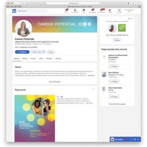
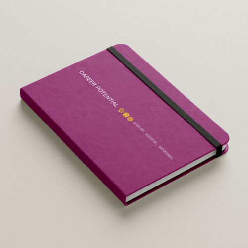
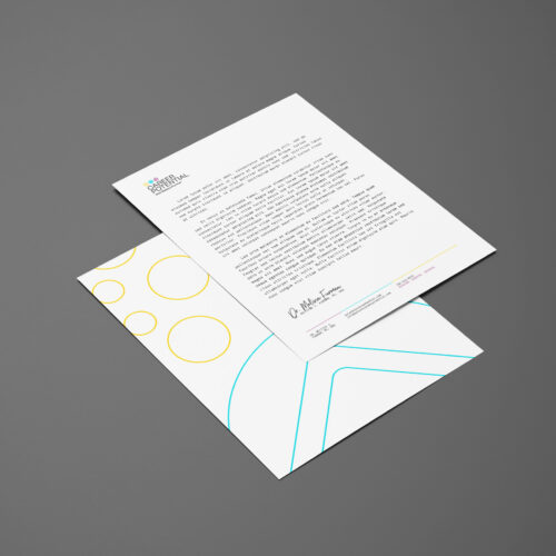
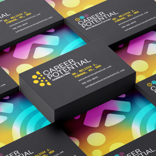
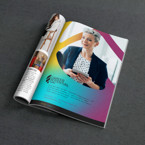
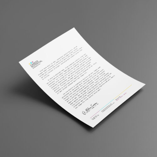
Please refer to the following examples general guide for brand look and feel. Remember when designing Career Potential assets to be mindful of legibility and balance. It’s important to establish an informational hierarchy to clearly communicate our messaging and tone.
Click on any of the images below to view a larger, uncropped version.
Let's Make it Real. Showpony is our trusted partner in taking everything we make from digital to tangible. From print to products, they do it all (and they do it well). Anything you'd like to see your brand on something that we haven't shown you? The Ponies can make it happen.
Get Started →
