
Guidelines and Brand Asset Library
Hello Comfort is all about approachability, friendliness and quality, while standing out from the competition. With the clouds, the sun, the sea and a totally differentiated color thrown in to boot, Hello Comfort is ready to make a splash in the Jupiter market by keeping your customers on cloud nine.
01 Logos
HelloComfort logos and icons for digital (RGB) and print (CMYK) purposes can be found here. Please remember it’s ideal to lead with full color logos, but in instances where contrast is limited designs should use a reversed or one color option.
Icon
Primary Logo


Secondary Logo


02 COLORS
The HVAC space is flood of reds and blues, so why not look to the sky and capture that Hello Comfort spirit with a nice balance of the two... purple! Complimented by a few other warm and cool hues, you’re ready to stand out and get noticed.
Please refer to the following color builds for standards when creating assets for your brand. For print use CMYK and for digital and web applications use RGB or Hex. As a general rule one color or pattern won’t lead over another, but be aware of balance and context when choosing color for designs.
Color 1
CMYK: 44, 100, 37, 16
RGB: 137, 28, 92
Hex: #891C5C
Color 2
CMYK: 6, 13, 88, 0
RGB: 243, 211, 60
Hex: #F3D33C
Color 3
CMYK: 0, 53, 100, 0
RGB: 255, 142, 0
Hex: #FF8E00
Color 4
CMYK: 68, 9, 14, 0
RGB: 60, 179, 208
Hex: #3CB3D0
A NOTE ON COLOR
While we always strive for color accuracy, there are many factors at play when viewing color on screen or on physical objects, like paper, signage and products. The “same” color will never look the same across different substrates—and even different monitors, screens and textures of paper reflect color slightly differently.
Therefore, please expect a certain amount of variation between print (chemicals on paper), web (light) and physical products (plastic/cloth/dyes, etc).
When color accuracy is paramount, we recommend printing using the Pantone Matching System (PMS). W/S will provide Pantone swatches upon request, which we recommend you approve before having anything printed.
We highly recommend you have your printer match colors to your satisfaction before moving forward on any print jobs.
03 FONTS
Signo is a typeface that’s here to sprint into action for all your headlines, while the super subtle rounded caps of Brandon keep the tone gentile and friendly. Together they make easy work out of getting the word out for your brand.


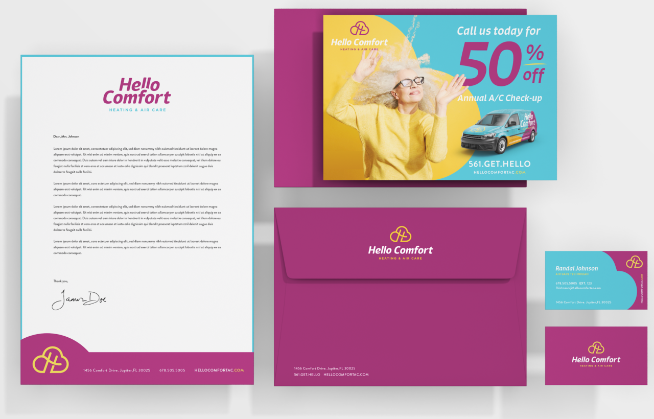
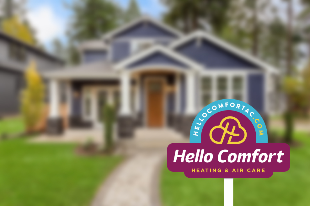
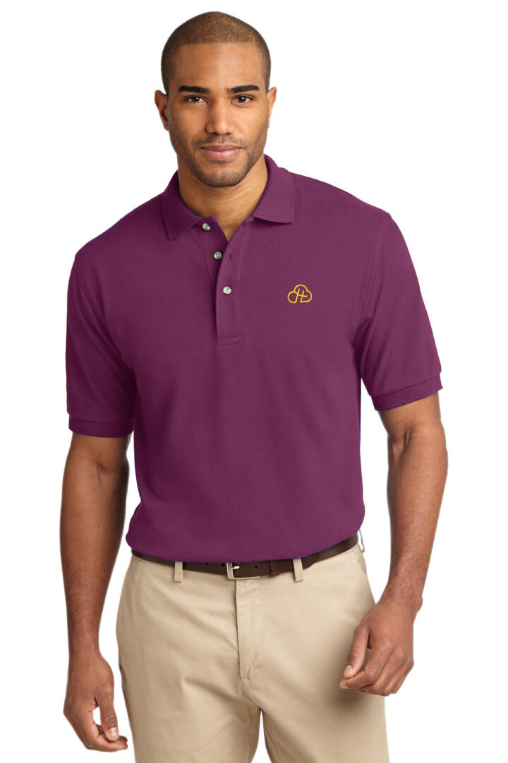
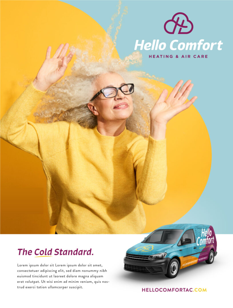
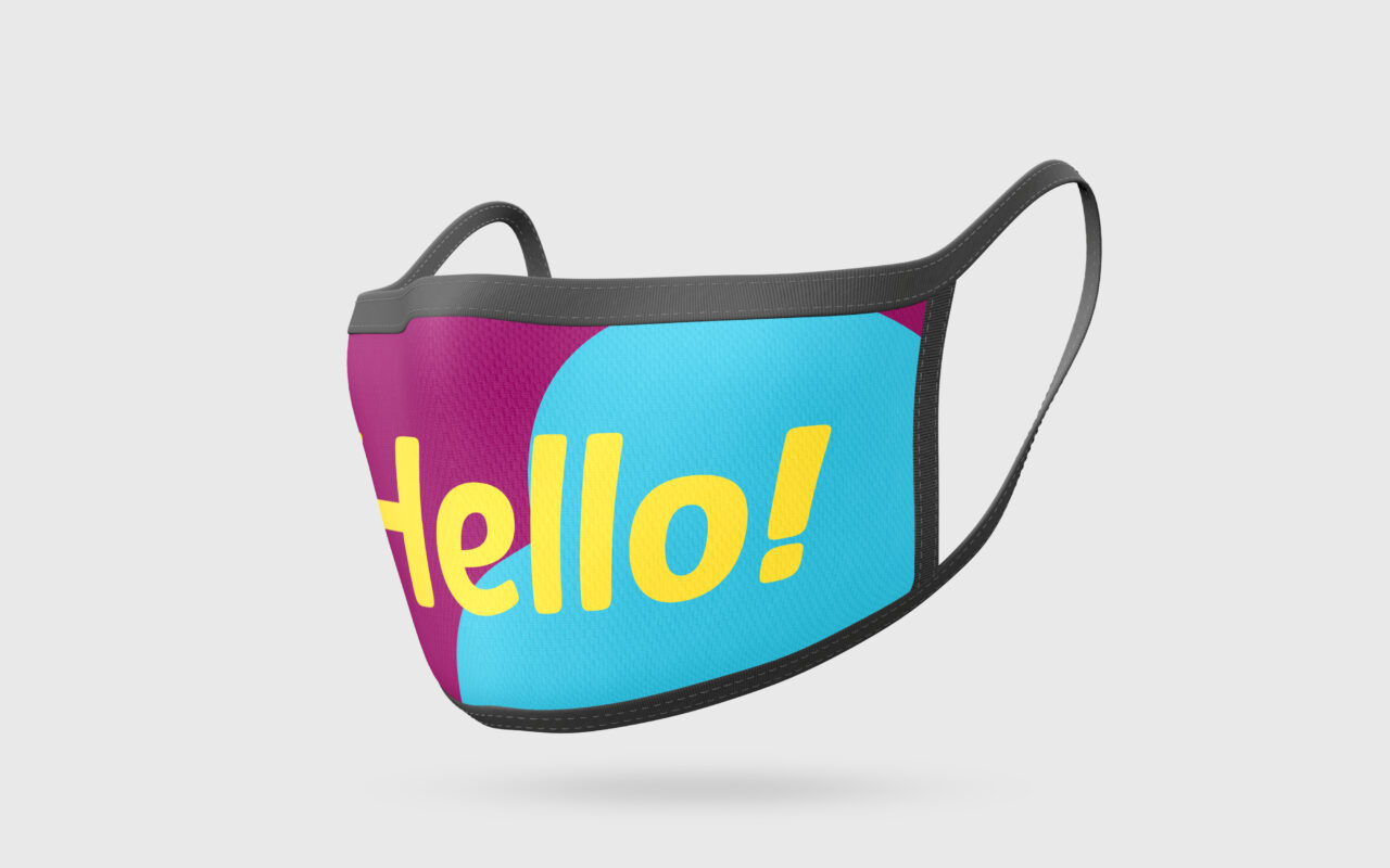
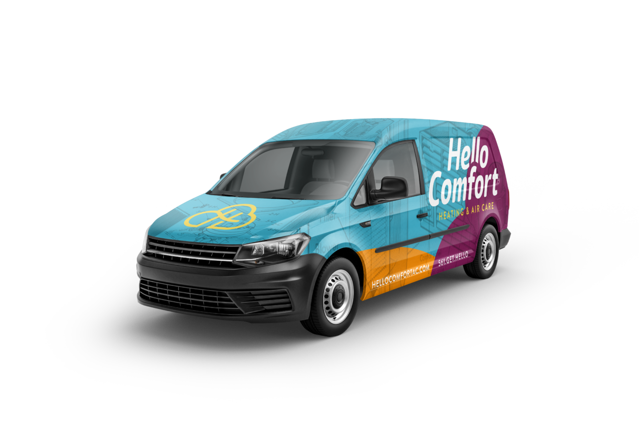
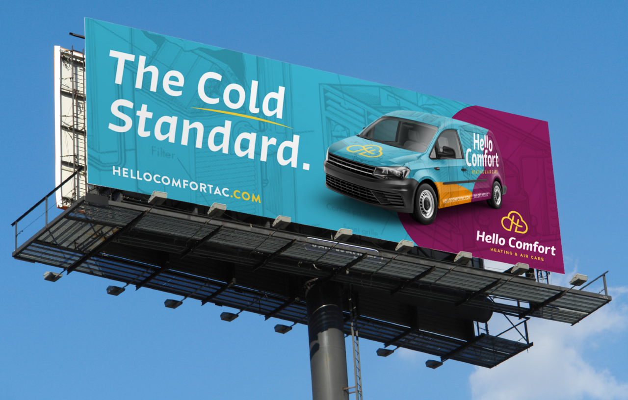
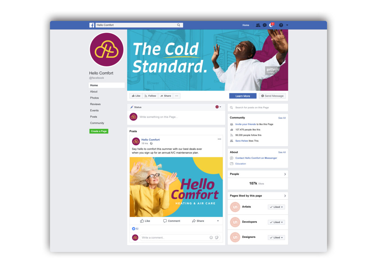
04 BRAND IN USE
Please refer to the following examples general guide for brand look and feel. Remember when designing HelloComfort assets to be mindful of legibility and balance. It’s important to establish an informational hierarchy to clearly communicate our messaging and tone.
Click on any of the images below to view a larger, uncropped version.
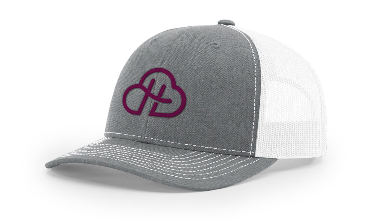
- Merch
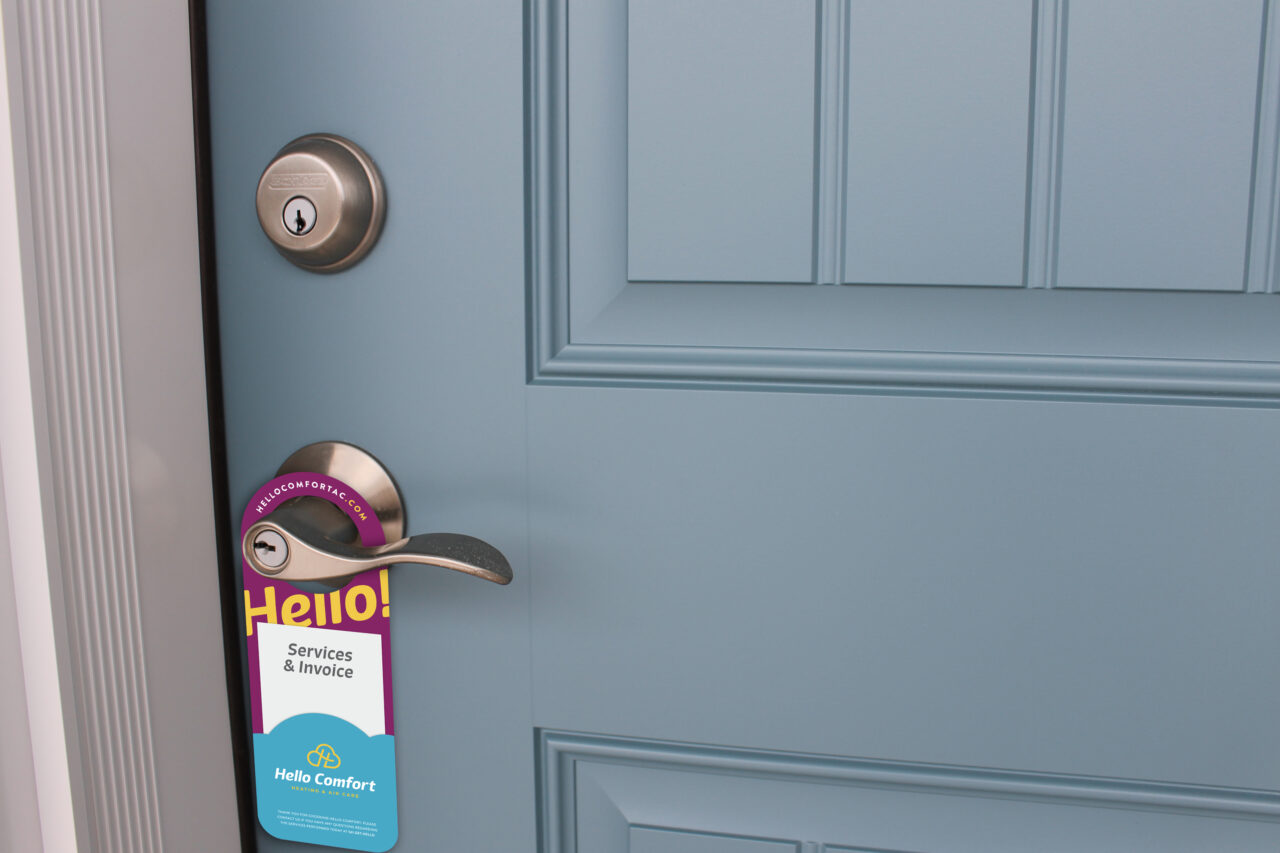
- Environmental
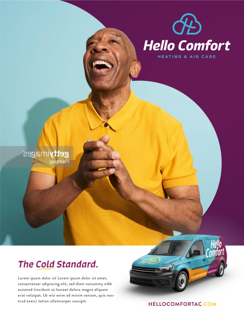
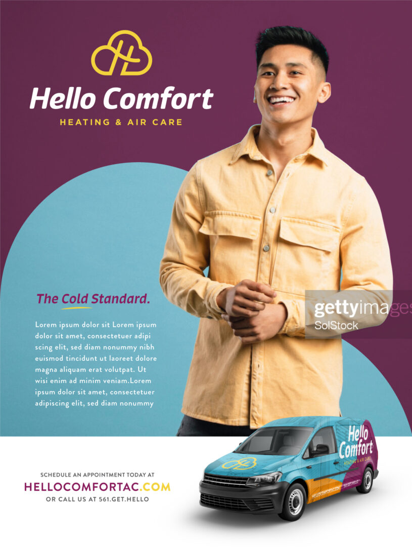
- Digital


Let's Make it Real. Showpony is our trusted partner in taking everything we make from digital to tangible. From print to products, they do it all (and they do it well). Anything you'd like to see your brand on something that we haven't shown you? The Ponies can make it happen.
Get Started →