Guidelines and Brand Asset Library
With origins in travel finance, it makes a lot of sense for Jetfi’s identity to have a slight nod to a little bit of globe trotting. And even though the biz will be expanding into other types of funding, the name and related branding still reflect Jetfi’s fast and easy services. We’ve created an iconic monogram and paired it with typography, color and pattern that are approachable, friendly and memorable and will give our audience a sense of trustworthiness paired with a healthy dose of fintech modernism.
Logos
JetFi logos and icons for digital (RGB) and print (CMYK) purposes can be found here. Please remember it’s ideal to lead with full color logos, but in instances where contrast is limited designs should use a reversed or one color option.


Patterns
The ZIP file includes an AI file with patterns in the different brand colors.
Colors
The colors hearken back to the days when travel was glamorous, smoking was still allowed on planes and not a single pair of sweat pants would be seen in the terminal. Bright, inviting and most importantly differentiating from your competitors.
Please refer to the following color builds for standards when creating assets for your brand. For print use CMYK and for digital and web applications use RGB or Hex. As a general rule one color or pattern won’t lead over another, but be aware of balance and context when choosing color for designs.
Navy
- HEX
- #2b4061
- CMYK
- 90% / 76% / 38% / 27%
- RGB
- 43% / 64% / 97%
- PMS
- --
Robin’s Egg
- HEX
- #b0ede8
- CMYK
- 28% / 0% / 12% / 0%
- RGB
- 176% / 237% / 232%
- PMS
- --
Yellow
- HEX
- #f0c708
- CMYK
- 7% / 19% / 100% / 0%
- RGB
- 240% / 199% / 8%
- PMS
- --
Cream
- HEX
- #fff2d1
- CMYK
- 0% / 3% / 20% / 0%
- RGB
- 255% / 242% / 209%
- PMS
- --
Red
- HEX
- #de1c1a
- CMYK
- 7% / 100% / 100% / 1%
- RGB
- 222% / 28% / 26%
- PMS
- --
A NOTE ON COLOR
While we always strive for color accuracy, there are many factors at play when viewing color on screen or on physical objects, like paper, signage and products. The “same” color will never look the same across different substrates—and even different monitors, screens and textures of paper reflect color slightly differently.
Therefore, please expect a certain amount of variation between print (chemicals on paper), web (light) and physical products (plastic/cloth/dyes, etc).
When color accuracy is paramount, we recommend printing using the Pantone Matching System (PMS). W/S will provide Pantone swatches upon request, which we recommend you approve before having anything printed.
We highly recommend you have your printer match colors to your satisfaction before moving forward on any print jobs.
Typography


Brand In Use
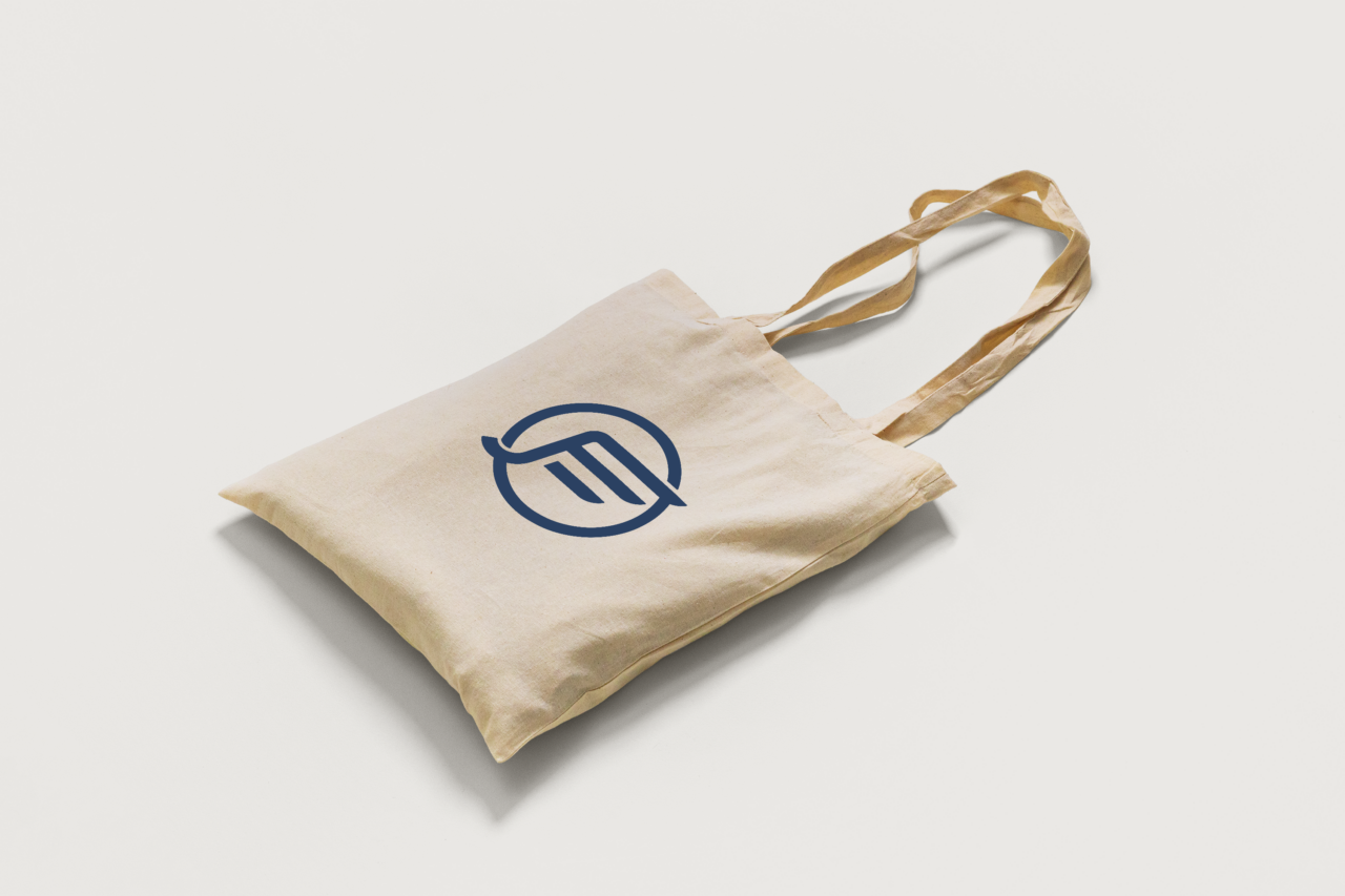
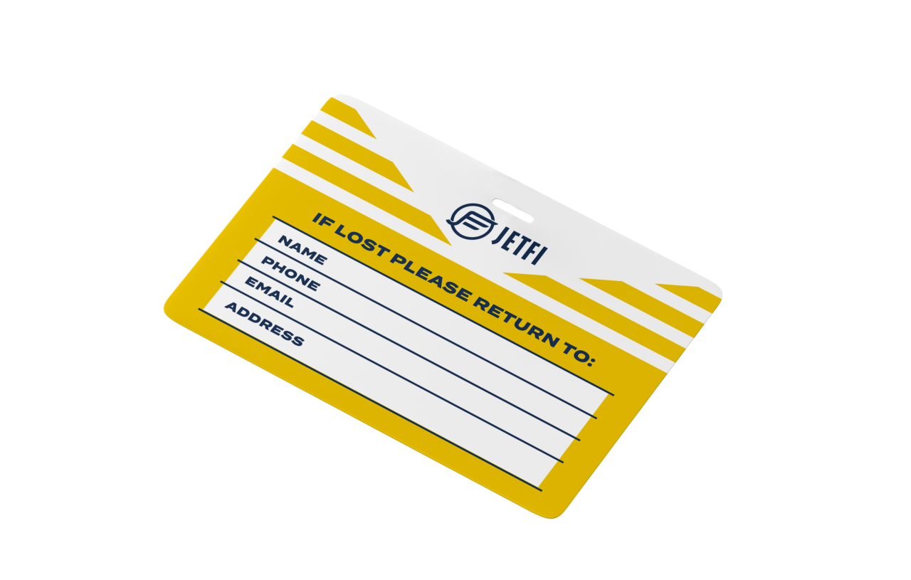
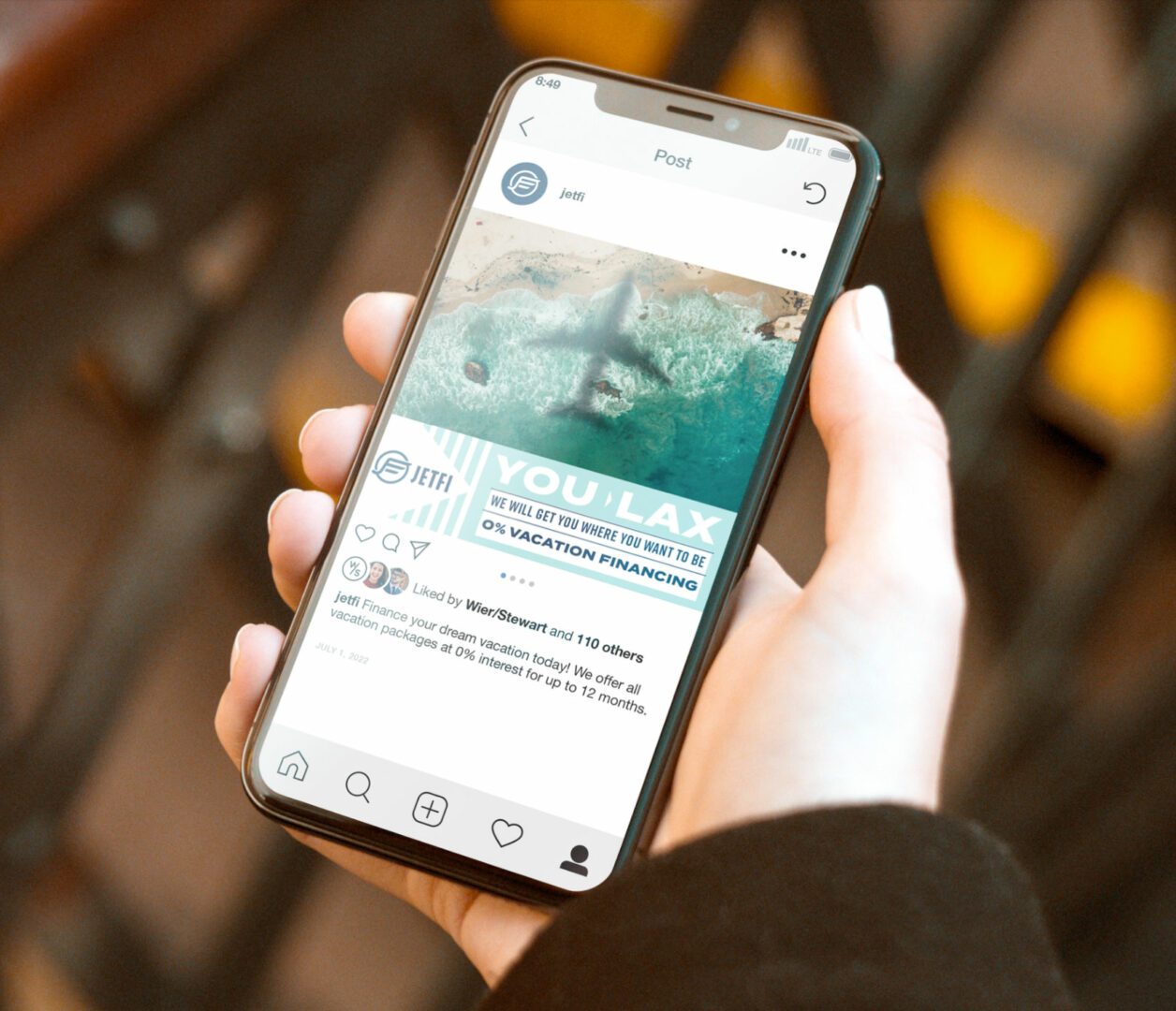
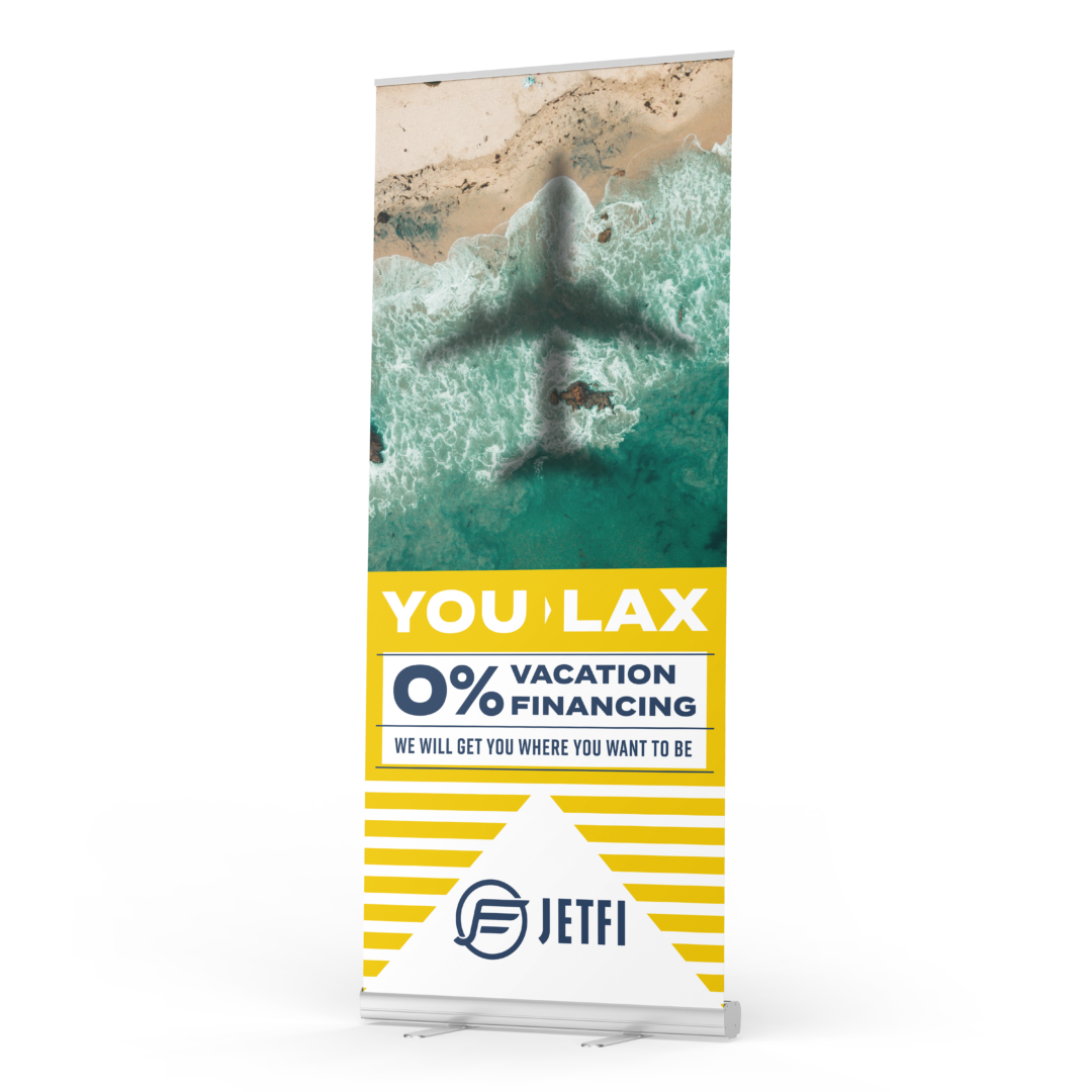
Please refer to the following examples general guide for brand look and feel. Remember when designing JetFi assets to be mindful of legibility and balance. It’s important to establish an informational hierarchy to clearly communicate our messaging and tone.
Click on any of the images below to view a larger, uncropped version.
- Merchandise
- Digital


Let's Make it Real. Showpony is our trusted partner in taking everything we make from digital to tangible. From print to products, they do it all (and they do it well). Anything you'd like to see your brand on something that we haven't shown you? The Ponies can make it happen.
Get Started →