
Guidelines and Brand Asset Library

BRAND BASICS
Capitalizing on the success you’ve had with Southeastern Cardiology, we’ve crafted a new, yet related, identity for your Gastrointestinal practice. The new practice sits solidly under the Southeastern brand umbrella, but is also its own entity. Our memorable approach is uniquely identifiable from other GI clinics in your market, builds upon your current brand equity, and has a little fun of its own.
01 Logos
Southeastern Gastroenterology logos and icons for digital (RGB) and print (CMYK) purposes can be found here. Please remember it’s ideal to lead with full color logos, but in instances where contrast is limited designs should use a reversed or one color option.
Horizontal Logo


Stacked Logo


Pattern
02 COLORS
Please refer to the following color builds for standards when creating assets for your brand. For print use CMYK and for digital and web applications use RGB or Hex. As a general rule one color or pattern won’t lead over another, but be aware of balance and context when choosing color for designs.
Color 1
CMYK: 13, 94, 83, 3
RGB: 207, 53, 57
HEX: #cf3339
PMS: 1797 C
Color 2
CMYK: 4, 27, 83, 0
RGB: 243, 189, 72
HEX: #f3bd48
PMS: 142 C
Color 3
CMYK: 100, 100, 28, 27
RGB: 33 20, 95
HEX: #25215e
PMS: 273 C
Color 4
CMYK: 45, 16, 15, 0
RGB: 140, 183, 201
HEX: #8cb7c9
PMS: 550 C
A NOTE ON COLOR
While we always strive for color accuracy, there are many factors at play when viewing color on screen or on physical objects, like paper, signage and products. The “same” color will never look the same across different substrates—and even different monitors, screens and textures of paper reflect color slightly differently.
Therefore, please expect a certain amount of variation between print (chemicals on paper), web (light) and physical products (plastic/cloth/dyes, etc).
When color accuracy is paramount, we recommend printing using the Pantone Matching System (PMS). W/S will provide Pantone swatches upon request, which we recommend you approve before having anything printed.
We highly recommend you have your printer match colors to your satisfaction before moving forward on any print jobs.
03 FONTS
We’ve selected Trade Gothic and the Avenir families as your brand fonts. They create a clear, clinical, and utilitarian voice able to communicate well, from big headlines to longer swaths of body copy and charts.
Header Copy

Body Copy

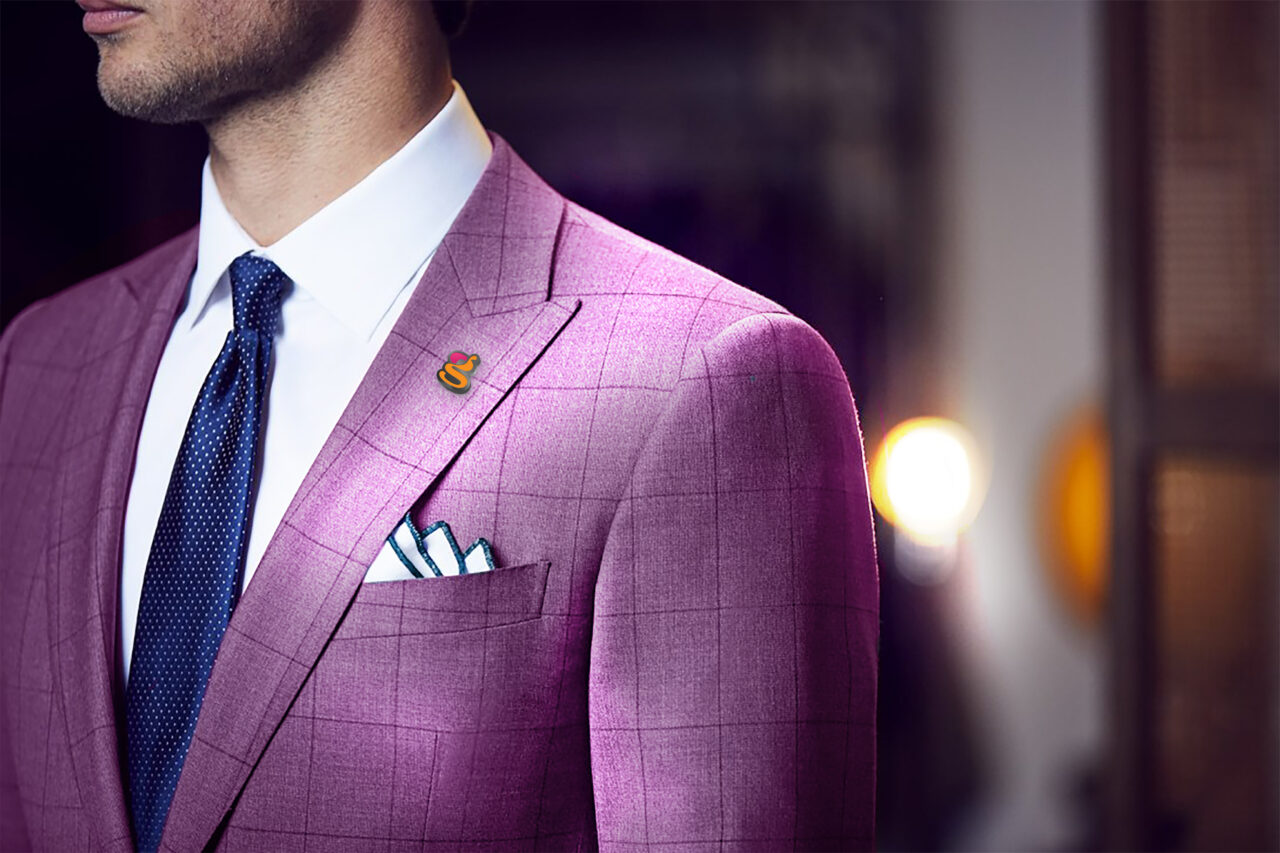
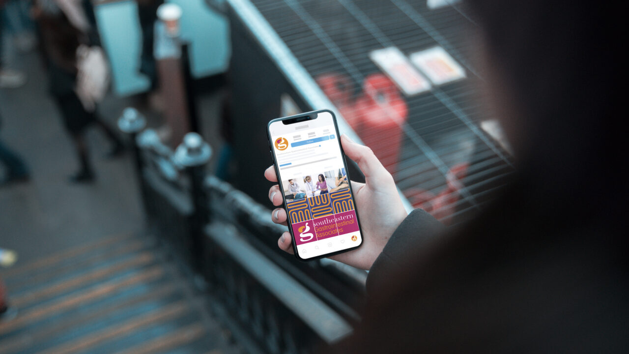
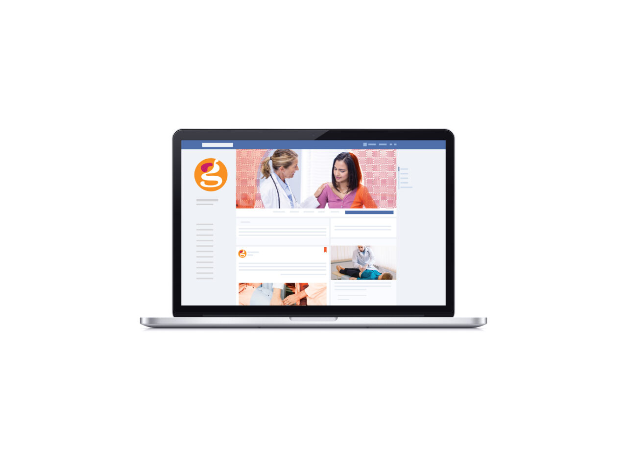
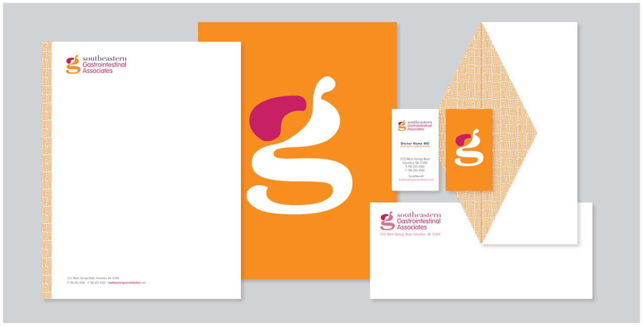
04 BRAND IN USE
Please refer to the following examples general guide for brand look and feel. Remember when designing Southeastern Gastroenterology assets to be mindful of legibility and balance. It’s important to establish an informational hierarchy to clearly communicate our messaging and tone.
Click on any of the images below to view a larger, uncropped version.
- Digital
- Merchandise


Let's Make it Real. Showpony is our trusted partner in taking everything we make from digital to tangible. From print to products, they do it all (and they do it well). Anything you'd like to see your brand on something that we haven't shown you? The Ponies can make it happen.
Get Started →